Upping Your Type Game
Note: This text was created as a talk for An Event Apart in San Diego. It was presented Tuesday, May 21st 2013. Many thanks to Stephen Coles for his advising and light editing. While the full slide deck is not shown below, about a quarter of the original slides are used as editorial illustrations.…
The Dark Art of Pricing
I know many of you went to art school and I’m assuming most of the people reading this article are designers, illustrators or others working within the world of what we reluctantly call “communication art”. When we graduated from art school, a career was promised to us. We wouldn’t spend…
Non-Creepy Networking: Party Etiquette
Note: This is Part 1 in a series of articles about non-creepy networking. There’s just too much to say to get it all out in one article. <p class="first"><span class="dropcap">N</span><span class="run-in">etworking. What an awful word.</span> It's one of those things…
Inspiration vs. Imitation
Every now and then I get a really lovely email from an aspiring letterer that is about to publish a passion project of his or her own. They tell me my work was an inspiration and that they can't wait to share their creation with the world. I feel all warm and fuzzy inside for a moment...until I…
Getting Freelance Work
Dear Designer McDesignperson,I am a current senior majoring in design/illustration. I was wondering what I can do to promote myself and get freelance work?....[five paragraphs of life story]...any advice you can give would be greatly appreciated! Thanks!" I am asked this question constantly (as are…
Productivity Quest: Email
E mail is one of those things that people endlessly bitch about. Remember when it was fun to get emails? When that “you’ve got mail” chime would sound and fill you with warm and fuzzy feelings because someone, somewhere, took time out of their day to write you a nice note or send you a chain…
Art (as) Therapy
I gave a talk at the AIGA national conference this year in Las Vegas, and with all short form talks I feel compelled to write out my thoughts in advance in the form of an essay (and then improvise quite a bit when I’m on stage). Here’s a transcript of the talk (minus my ice breaker jokes) for…
Productivity Quest: Ultra-Schedule
One of the best parts about being a freelancer (or “Running a One-Person Studio” as I prefer to say) is having a flexible schedule. Yes, client deadlines impose some structure to your calendar, but for the most part (if you’re willing to work strange hours) work and life can blend smoothly…
On Internships
As I’ve watched my flowchart get reposted around the internet a bit, there is a topic that is always brought up in comments that I didn’t address on the chart itself: internships. I purposefully avoided talking about them on the chart, just as I avoided diving into great detail about non-profit…
I am not a web designer.
Note: This is a recently edited article I originally wrote in 2010. Since writing it, I’ve accumulated a heck of a lot of HTML and CSS skillz (I made this here website!), but I still do not offer my web design or front-end dev services to clients. There will be an article to follow specifically…
How do you deal with rip-off-ers?
Note: What follows is email correspondence between myself and a designer seeking advice. Names have been anonymousized, and I’ve subtracted praise since it would be icky of me to just post praisey emails. Hi Jessica, I've been lucky enough to land imitators of my work in the last few months, some…
About
Here’s a brief history of who I am, what I do, and why we should be friends: I grew up in Pennsylvania, raised by two non-creatives that decided it would be OK to let their little girl pursue a seemingly impractical career. I ended up attending a wonderful art school thanks to an amazing high…
Fighting Creative Burnout
If you are a freelance designer / illustrator / general creative person, and have established momentum in your career that has lasted a decade or more, one of the things you will be asked time and time again is how you stay interested and inspired in the work you are doing. There are a lot of ways…
Do I keep my crappy job?
Note: What follows is email correspondence between myself and a designer seeking advice. Names have been anonymousized, and I’ve subtracted praise since it would be icky of me to just post praisey emails. Dear Ms. Hische, My name is Person, I’m 21 and I’m going to be graduating from college…
Do you ever feel overwhelmed?
Note: What follows is email correspondence between myself and a designer seeking advice. Names have been anonymousized, and I’ve subtracted praise since it would be icky of me to just post praisey emails. Hi Jessica, I recently graduated from a graphic and package design program (whoop!) and…
How do I critique a sensitive person?
Hello, I’m hoping you have thoughts to share on coping with a much less experienced designer who wants me to just say “That looks great, sweetie!" and give him a cookie. But my job is to art direct, sharing the benefit of my experience with him. If the type is ugly and impossible to read,…
Is my school holding me back?
Note: What follows is email correspondence between myself and a designer seeking advice. Names have been anonymousized, and I’ve subtracted praise since it would be icky of me to just post praisey emails. Dear Jessica, You mention how critical the curriculum and environment at Temple was in…
ICON
The Illustration Conference [ICON] is a grass-roots, professional organization established in 1997 to serve the illustration community and promote the use of illustration in all media, provide a platform for illustrators and image-makers to address issues from a tight knit community and develop new…
How did you build your online presence?
My online communities have always started as a reflection of my “real life” communities. I joined Twitter in 2008 and more than half of the people I followed and interacted with at that time were people I knew in person and saw frequently—studiomates and work friends made through design…
How did you become a letterer?
When I was in college, I was too broke to buy decent fonts. I knew that I could either approach every project with my limited number of typefaces, spend days digging through terrible free font websites to find anything even remotely acceptable, or “draw my own fonts” (I say this in quotes…
How important is style?
To a letterer or illustrator, style is incredibly important. When you are hired as an illustrator, you’re hired to work in a style that your portfolio proves you excel at. The person that hires you is most often not the end client—you’re hired by an agency or a publisher that is working for a…
What's your lettering process like?
All of my work begins with a sketch. I used to sketch entirely by pencil (and still do from time to time!) but lately I’ve been sketching in ProCreate on an iPad Pro. I still treat it like a pencil and paper when I’m starting out—working in all black and white and using the “6B pencil”…
Type Rugs
As some of you may know, I purchased a Cintiq tablet a few weeks ago and have been having a blast with it. I’m not here to write a big consumer review, but I can say that it has changed my process quite a bit. I wasn’t a Wacom user prior to purchasing the Cintiq (all of my vector…
With Everything Going On
This artwork was created as a part of Adobe’s Make it with Illustrator on the iPad event. Adobe Make It is an event series designed to bring together diverse groups of talented artists and challenge them to create with Adobe's latest and greatest tools. They invited 24 artists from around the…
Design Indaba
Since 1995, Design Indaba has been committed to a vision that is built on the belief that creativity will fuel an economic revolution in South Africa. As such, Design Indaba is a celebration of design in a country iconic of the triumph of the human spirit. Proof that even the most intractable…
TYPO Berlin
TYPO conference speakers are innovative designers, professors, marketing experts, scientists, artists, journalists and much more. They present and discuss diverse approaches in the fields of communication and design. TYPO inspires, offers insights and experiments, encourages the exchange of…
Moonrise Kingdom
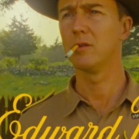
This year I had the absolute honor of creating the film titles for Wes Anderson’s newest film, Moonrise Kingdom. I worked directly with Wes and his small team of co-producers to bring his vision to life. The film is based in New England in the early 60s, you can see the trailer here. The initial…
Semi-Permanent Sydney 2016
We’ve ditched the lectern and curated an exciting new program that will focus not only on inspiring, but also enabling the creative community. The Thursday and Friday programs are about giving you real-time, global insights into getting the best out of your business or your role within one.…
TypeCon
TypeCon2011 surges into the Big Easy. Dozens of the brightest names in type and design will share their knowledge and skills, exploring topics such as: Japanese typography; the champions of readability; typography for the web; the graphic history behind QSL cards; book design and bookbinding;…
Jess & Russ Keepsake
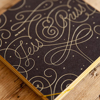
When Russ and I announced we were getting married, the pressure was on to do something awesome for our invitations. Instead of doing a printed invite, we created a crazy parallax website and enlisted the help of our friends to create artwork for it. While everyone loved the site, as the big day…
Evan & Christina
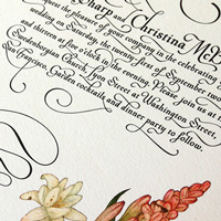
My friends Evan and Christina asked if I would help them out with their wedding invitations and I ended up going a little overboard. For their invites, I was very inspired by the Mira Calligraphae Monumenta—the look and feel of these pieces of art really capture Christina’s style and the style…
Chill Vibes
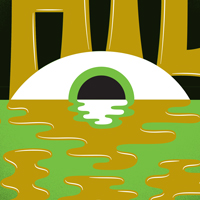
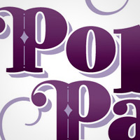
For a special music-focused edition of Pop-Up Magazine (a live "magazine" featuring talks and performances), I and several other artists were asked to make art for special edition prints. The size was influenced by an LP and just had to conceptually tie in to our feelings about music in California.…
You Are Enough
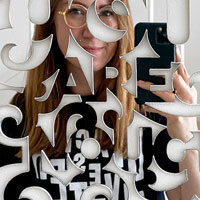
One day I caught my daughter staring at her face in the mirror. I asked her what she was thinking about and she told me she wished she had a different and more beautiful face. I nearly broke down and cried on the spot. She doesn’t watch shows that are all about superficial beauty. She isn’t…
Press Page
Here you’ll find everything you’ll need to get that blog post or magazine article rolling. Because there’s already oodles of information about me online—on this site and elsewhere—I advise against contacting me for Q&A style interviews. Plus they’re kind of lazy. Writers are…
ICON Poster
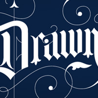
When John Hendrix, an illustrator I completely admire (and a person I really like!) contacted me about being a part of ICON's new promotional materials I was pleased as punch. As a member of the illustration community, nothing could be more thrilling than helping promote their leading conference in…
Talent Search

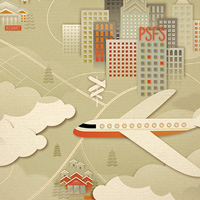
Plan Sponsor Magazine is a wonderful publication if only for one reason: SooJin Buzelli. As creative director at its parent company Asset International, she has helped make the magazine essentially a showcase for illustration talent. This was one of the more difficult editorial jobs I worked on…
Creative Mornings
CreativeMornings is a monthly breakfast lecture series for creative types. Each event is free of charge, and includes a 20 minute talk, plus coffee!
What inspired you to become a designer?
When I was in college I took a lot of electives in different art areas, always thinking I would end up majoring in that discipline. I loved glass, I loved wood-working, I loved painting and drawing; then I took a design class. I really loved the idea of having a problem to solve, of having limits…
I love love.
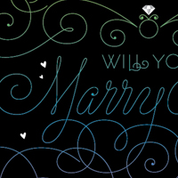
I get a good amount of emails requesting quotes for personal work like tattoos and wedding invitations, and unfortunately for the most part I can’t take them on (I actually have a “blood relatives only” policy for tattoo design). When Stuart Lang wrote me to ask if I’d help him propose to…
What advice would you give to a young designer?
Be nice to people. Being a nice and genuine person will get you so much farther than your portfolio will. When you’re applying for a job, the first thing an employer thinks is “Would I mind spending nine hours a day with this person?”. If you try in whatever ways you can to brighten…
How did you build your “personal brand?”
When I graduated college, everyone wanted to set up a studio under a different name than their own. They wanted to be treated as an agency rather than an individual. This is really useful if the kind of clients you want to attract are the kind that want an agency behind the work, but I really…
Neiman Marcus Holiday 2022 Cookie Jar
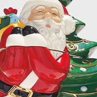
Neiman Marcus commissioned me to create a massive suite of designs for their 2022 Holiday campaign. The work included the creation of a custom alphabet, character designs and spot illustrations, several custom lettering pieces, and a design system for culinary gift packaging. This piece is one of…
Visual Pollution
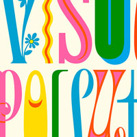
A few designers (Gabriel Amijai Benderski Perez, Juan Martín Lusiardo, and Santiago Ternande partnered with The Vignelli Center for Design Studies and the Vignelli Archive to organize a poster show to celebrate 90 years of Massimo Vignelli’s influence. Vignelli was of course an absolute legend…
What do you do when you're not working?
I have three children, and spending time with them occupies most if not all of my non-work time. I tend to carve out free time for myself during the work week (when I have childcare) rather than on the weekend. During these occasional moments of freedom, I picnic at Lake Merritt, visit my favorite…
Design Thinkers Toronto
DesignThinkers is Canada's largest annual graphic design conference, connecting designers from around the world. DesignThinkers speakers examine and discuss the trends, strategies and processes that are driving our industry. Attendees have the opportunity to explore the evolving role of design and…
Offset
Originally an initiative of The Small Print when it begun in early 2009, OFFSET has quickly grown into an strong entity in itself. Run by Peter O’Dwyer, Bren Byrne and Richard Seabrooke (all creatives living and working in Dublin) it has become Dublin’s premier creative festival attracting…
The Peanut Gallery
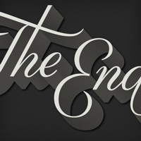
Google contacted me to be a part of a fun secret project that they were putting together to help showcase their Speech API in the most recent Chrome update. They would build a site that allowed you to voice the words in a silent movie, and the Speech API would insert them as dialogue cards…
826 Captain’s Log
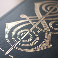
From their site: The Captain’s Log is just the place to put all those star charts and navigational notes you’ve heretofore been stashing in crumpled bunches in pockets and drawers and other misguided places. Keep your voyage plans—and your almost too accurate caricatures of the entire…
Politics at the Dinner Table
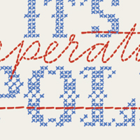
The Washington Post magazine ran a special feature on the one-year anniversary of the election, asking artists and contributors to propose one specific idea to help fix American civic life. For my idea, I wanted to address how it's often seen as taboo to talk politics with family at the dinner…
Code Mode Light
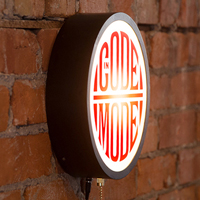
So often I felt like I needed a sign above my head when knee deep in HTML, CSS, Jquery, email, writing—all the activities that require undivided attention—so that my studio mates would know that whatever questions they asked me where going in one ear and out the other. Grant from Fair Goods…
Procrastiworking Poster
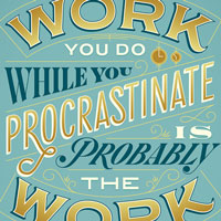
A number of years ago, I was asked “What’s one piece of advice you would give to aspiring designers?” by the site Humble Pied, to which I replied “The work you do when you procrastinate is probably the work you should be doing for the rest of your life.” This quote seemed to really ring…
Neiman Marcus Holiday 2022 PJs

Neiman Marcus commissioned me to create a massive suite of designs for their 2022 Holiday campaign. The work included the creation of a custom alphabet, character designs and spot illustrations, several custom lettering pieces, and a design system for culinary gift packaging. Several of the…
Neiman Marcus Holiday 2022 Sugarfina Collaboration
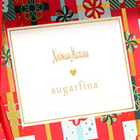
Neiman Marcus commissioned me to create a massive suite of designs for their 2022 Holiday campaign. The work included the creation of a custom alphabet, character designs and spot illustrations, several custom lettering pieces, and a design system for culinary gift packaging. Neiman Marcus…
What's the difference between Lettering and Fonts?
Lettering is essentially illustrations of letters, words, and phrases. As a letterer, when I’m hired to draw the word “holiday” I don’t first draw the entire alphabet in the style I wish, then position the letters to spell out the word. I draw the word as a unique image. This means that in…
Neiman Marcus Holiday 2022 Culinary Packaging
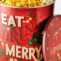
Neiman Marcus commissioned me to create a massive suite of designs for their 2022 Holiday campaign. The work included the creation of a custom alphabet, character designs and spot illustrations, several custom lettering pieces, and a design system for culinary gift packaging. These beautifully…
Webstock
Webstock 2012 will be bestest, greatest, most amazingly awesome conference ever. In the history of the world. Fact. Two action-packed days of aspiration, inspiration and brain stimulation, starring 20+ stars of the web firmament; a veritable hotbed of uber-talent. Experts in HTML5, CSS3, responsive…
TYPO San Francisco
TYPO conference speakers are innovative designers, professors, marketing experts, scientists, artists, journalists and much more. They present and discuss diverse approaches in the fields of communication and design. TYPO inspires, offers insights and experiments, encourages the exchange of…
FITC Amsterdam
Now in its 12th year, FITC returns to Amsterdam to host their groundbreaking design and tech event on the future of innovation, design and all the cool shit in between. FITC Amsterdam features the world’s most innovative, technical and creative talks that will inspire you to pursue your dreams…
The Circle
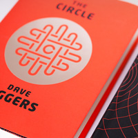
After working with Dave Eggers on Hologram for the King I was pumped to be brought on board to design his new book, The Circle. It was especially fun to design this cover, as I’ve spent the last two years living in San Francisco surrounded by the tech industry (my husband works for Facebook) and…
Sprint
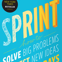
The team at Google Ventures hired me to create a unique design for their upcoming book about Design Sprints, which help companies test ideas quickly, promising that within five days you can move from idea to prototype to decision. Jake and his team (along with the publisher) had worked on some…
Type Rug!
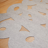
I am a perpetual decorator, and while I totally love Erik’s and my studio, I’m always looking for little ways to improve it. I had been thinking about how good a rug would be for the space for a while, but we already have so many rectangular objects in the room I thought that if we did get…
Magic Hours
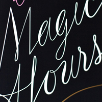
In Magic Hours, award-winning essayist Tom Bissell explores the highs and lows of the creative process. He takes us from the set of The Big Bang Theory to the first novel of Ernest Hemingway to the final work of David Foster Wallace; from the films of Werner Herzog to the film of Tommy Wiseau to…
Semi-Permanent, Sydney
Semi-Permanent is a world leading design conference that to date has hosted 29 events in 9 cities, covering 5 countries, with over 200 speakers and 50,000 attendees. In 2012, Semi-Permanent celebrates ten years of events- that's a decade full of stories and wisdom from industry idols. The event…
Shopping in Marrakech
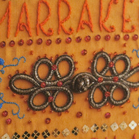
This fun guidebook was especially fun to design. I developed the lettering first in illustrator and spent three days embroidering the cover for this book (the original now hangs on my wall). The interior is also decorated with bead and embroidery ornamentation where possible to make for a very rich…
California Sunday Magazine
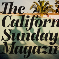
The California Sunday Magazine roams across California, the West, Asia, and Latin America, telling stories for a national audience. It explores science, business, entertainment, politics, technology, art, social issues, sports, food, and more. I worked with Doug, Carl, and Leo on developing the…
The Pussy Project
Helena Price, a dear friend and talented photographer, contacted me about a project she was swiftly putting together before the election. Like her Techies project, which gave voice to under-represented people in tech, she wanted to help give a face and voice to people who are all too often talked…
Silencio Sans
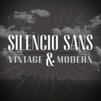
Silencio Sans was originally developed for CAA’s (Creative Artists Agency) to be used on their Friday Night Party invitation in 2014. The party’s theme was “old Hollywood” so the design inspiration came from movie title credits. The name Silencio references silent films, but this font would…
Design Camp
Since 1980, Design Camp® has been AIGA Minnesota’s premiere event and the largest regional design conference in the country. Held annually in late September/early October at a lodge in northern Minnesota, this event sets the standard for design conferences across the country. Design Camp…
Party Nails
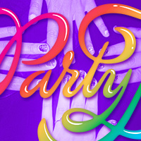
I love Party Nails. Party Nails is a side project / business set up by Taylor Watson, a lovely lady from San Francisco with a passion for all that glitters (I included a few instagrams for context). About once a month, she sets up shop in a local bar and between 7pm and 11pm (or sometimes later)…
Party Nails

I love Party Nails. Party Nails is a side project / business set up by Taylor Watson, a lovely lady from San Francisco with a passion for all that glitters (I included a few instagrams for context). About once a month, she sets up shop in a local bar and between 7pm and 11pm (or sometimes later)…
Nike Leave a Message
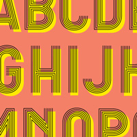
Nike 6.0 presents this latest film project, the film Leave A Message, starring only the new generation of woman athletes who want to create and innovative visions of the new limits of the category. The group of talented girls includes surfers Carissa Moore (Hawaii), Lakey Peterson (USA), Laura…
Adobe Love You
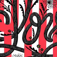
I was commissioned by Adobe to create art with the brief "start small and say something really big" to show how impactful a little vector graphic can be when you bring it out into the world on a grand scale for people to enjoy and engage with. I've drawn the word "love" more times than I can count,…
IC & Friends
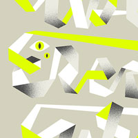
When Don Clark from Invisible Creature reached out to see if I wanted to participate in their ongoing series IC & Friends, I of course jumped at the chance. Each artist is asked to do their own interpretation of the Invisible Creature mummy on a shirt and the sky is nearly the limit in terms of…
An Event Apart: DC
An Event Apart DC features 12 great speakers and sessions. Following the two-day conference comes an intense full-day workshop on Responsive Design led by Ethan Marcotte (author, Responsive Web Design, A Book Apart, 2011).
Powerade Sympathy
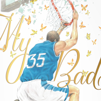
For this Powerade campaign, I collaborated with the team at Wieden + Kennedy and an outside illustrator to create fake sympathy cards that athletes could send to each other after owning one another at their respective sports. The look we were going for was a cheap 80s/90s (or even earlier) discount…
NPR Calendar
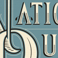
I was so excited to be asked to be a part of the 2013 NPR calendar, and even more excited when I found out my artwork was to be used on the cover! Here’s a little bit about my piece: “As someone that consumes a massive amount of "guilty-pleasure" media, NPR is one of very few sources of…
This Machine Kills Spreadsheets
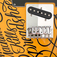
Blackline contacted me for a super unique project—creating lettering that would be painted on a Fender Telecaster and then given away as a prize at their annual tech conference. The quote is an obvious homage to Woody Guthrie’s iconic guitar decrying fascism. They admitted it was a slightly…
Interlink
Interlink Conference is a small hand-crafted event created for all types of creative web professionals. Explore the intersection of web design, code, and content during 2 empowering days of curated talks and workshops in Vancouver. (Plus, there’s dodgeball.)
Jess & Russ
I can’t say I was a normal girl, fantasizing about my wedding day from the time I could walk, but when Russ proposed I was ecstatic. A few days later the congratulations started pouring in from friends and stranger-friends along with one enthusiastic and intimidating statement: “Your wedding…
Web Directions South
From their site: “Founded in Australia in 2004, by long time web industry figures Maxine Sherrin and John Allsopp, Web Directions conferences bring together the web industry’s leading experts from around the world to educate and inspire our attendees. Unlike many conferences, rather than…
Semi-Permanent: Auckland
Semi-Permanent is a world leading design conference that to date has hosted 29 events in 9 cities, covering 5 countries, with over 200 speakers and 50,000 attendees. In 2012, Semi-Permanent celebrates ten years of events- that's a decade full of stories and wisdom from industry idols. The event…
Divinity of Second Chances
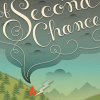
In On the Divinity of Second Chances, Kaya McLaren portrays a family on the brink of dissolution-a mother besieged by middle age, a distant father lost in daily life, and their three teenage children struggling in various ways with the family's disintegration even as they conceal a secret that…
Ragnarok Survival Kit
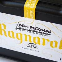
This was one of the most fun projects I’ve had the pleasure of working on! John Hodgman contacted me to design a special gifty edition of his Ragnarok DVD—a survival kit full of weird and “useful” items for surviving Ragnarok. Included in the kit: survival mayonnaise, a urine flask engraved…
Minot Font
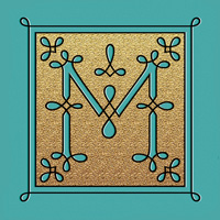
Minot is a new display typeface that I had a ton of fun making and hope you guys have just as much fun playing with it. The typeface comes in three styles: Outline, Fill, and Box, and they're meant to be used together to create multi-color headlines. I had fun messing with it myself and making…
A Hologram for the King
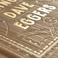
When I was contacted by McSweeney’s about designing Dave Eggers’ upcoming book, I was beside myself. It felt like I was being asked to join a secret society—they assured me over and over again that there were only a few people that even knew the book was underway. I have been a fan of…
Friends of Type
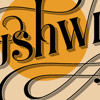
Friends of Type invited me to guest post on their wonderful site. I totally jumped at the opportunity especially since I was the first solo girl to post! (Script & Seal posted a few weeks earlier and they are 1/2 lady, 1/2 dude). I had a tonnnn of fun coming up with something new to draw every…
Italianissimo
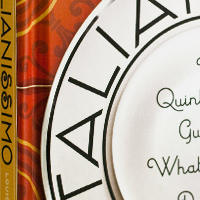
This book, written by Louise Fili and Lise Apatoff, is a wonderful visual guide of objects and activities that are quintessentially Italian. This book was very fun to work on, as each spread presented a new challenge, whether it was a hand-colored photo, an illustration, or a photoshopped collage…
Design Thinkers
DesignThinkers is Canada’s largest annual design conference, and one of the most respected in the world, welcoming professionals from the creative and business communities alike.
Neiman Marcus Holiday 2022 Snow Globe
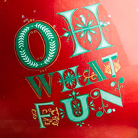
Neiman Marcus commissioned me to create a massive suite of designs for their 2022 Holiday campaign. The work included the creation of a custom alphabet, character designs and spot illustrations, several custom lettering pieces, and a design system for culinary gift packaging. This beautiful musical…
Where did you go to school and why did you go there?
I have a BFA in Graphic Design from Tyler school of Art, Temple University, in Philadelphia. I mostly went to Tyler because it was a good school that I could afford and they accepted me with a pretty unimpressive portfolio of student work—just the standard self portraits, wonky ceramics, and…
Interessante
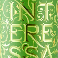
Barrel + Ink pairs outstanding wine makers with artists to create unique special edition releases of wines. I was paired up with Andy Erickson, which was a match made in heaven—we got along terrifically and it was an absolute pleasure getting to know him, his family, and his wine over the course…
Reading Love Collection
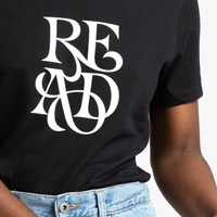
Amazon approached me to create a suite of lettering pieces for use on t-shirts, hoodies, totebags, and more as a part of a collection they were calling Reading Love. Sally Singer, Amazon's head of fashion direction and a fashion expert, provided industry guidance, vision, and development and…
OFFF 2018
OFFF is an incredible creative conference with a huge lineup of artists from diverse backgrounds. This is my second time participating in the festival, and I’m extremely excited to head back to Barcelona.
Mahonia Vineyard
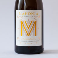
When Travis first contacted me to design labels for his special “Clonal Series” of pinot noir wines, he knew he wanted something really special. With only 30 cases produced of each clonal variety, the labels had to feel as special as the wines themselves. I created a MV monogram and lettered…
You’re My Pinspiration
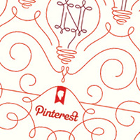
I was super pumped when Pinterest co-founder Evan asked me if I wanted to meet up to talk about working together in some way or another. He had a fun idea to do prints and cards and to make the price really reasonable so that they'd be accessible to all of their awesome users, not just the gold…
Neiman Marcus Holiday 2022 Glass Plate
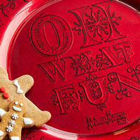
Neiman Marcus commissioned me to create a massive suite of designs for their 2022 Holiday campaign. The work included the creation of a custom alphabet, character designs and spot illustrations, several custom lettering pieces, and a design system for culinary gift packaging. This beautiful…
Vista Print Holiday Cards
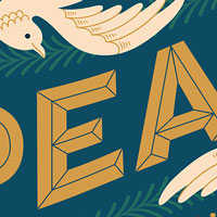
Adam and I had worked together on a project for Florence and the Machine years ago and his agency had grown quite a bit since since then. I was happy when he reached back out for a new project—this time with massive online printer / stationer Vista Print. They wanted to create a series of cards…
Mom, This is How Twitter Works
So I wasn't trying to make some sort of political statement about women in technology when I made this really fun and really useful website—it actually was originally intended for my mom, the most tech-savvy person I know over 50. While twitter seems a very simple service, it’s actually quite…
The Jessica’s Are Turning 30
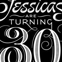
The Lily is a publication from The Washington Post that elevates stories critical to the lives of women. For their biggest project of the year, they were looking at what it’s like to be a 30-year-old woman in America today. In 1989, 30 years prior, the most popular baby girl name was Jessica.…
Penguin Drop Caps
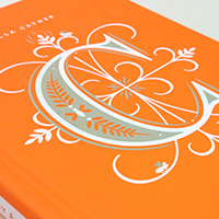
Penguin Drop Caps is a series of twenty-six collectible hardcover editions of fine works of literature, each featuring on its cover a specially commissioned illustrated letter of the alphabet by yours truly! A collaboration between myself and Penguin Art Director Paul Buckley, whose series design…
Pride & Prejudice for Audible
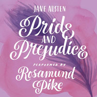
For this “book cover” for a special Audible release, I got down and semi-dirty with some brushes and inks. I am new to the world of watercolors, so I asked a friend more familiar with the medium to make a few background textures I could play with. I inked the feather and lettering (which was…
How to Raise a Reader
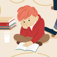
An indispensable guide to welcoming children—from babies to teens—to a lifelong love of reading, written by Pamela Paul and Maria Russo, editors of The New York Times Book Review. The book itself is full of illustration by four different illustrators, and I was tasked with helping the cover tie…
It Happened One Night

It’s always a thrill to design for the Criterion Collection and discover / rediscover amazing films throughout history. The lettering for this cover was inspired by a sign in the film itself—at about an hour in, we see a bit of neon signage for the Night Bus to New York in a lovely vintage…
Neiman Marcus Holiday 2022 Glassware
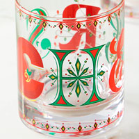
Neiman Marcus commissioned me to create a massive suite of designs for their 2022 Holiday campaign. The work included the creation of a custom alphabet, character designs and spot illustrations, several custom lettering pieces, and a design system for culinary gift packaging. The custom alphabet…
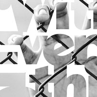
Without Type
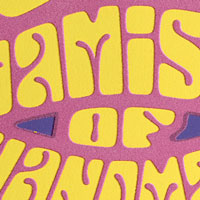
The Letterform Archive, in collaboration with the San Francisco Center for the Book, put on an exhibition called Without Type: The Dynamism of Handmade Letters. The exhibit featured many beautiful pieces of lettering from The Letterform Archive’s collection and I was commissioned to create a…
Ride for the Roses
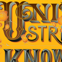
The Livestrong Foundation commissioned me to make a special edition poster to be given to a select number of donors at one of their biggest fundraising events, Ride for the Roses in Texas. Instead of putting the focus on “Ride for the Roses” itself, I chose to make the poster about the…
Give Back
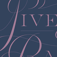
This was a self-initiated piece the week of Juneteenth in 2020. I posted it to instagram with this caption: “Made this yesterday while I contemplated what I could do next to help make the design community more inclusive. Lots of ideas rolling around, which are more possible to execute these days…
GigaOm Roadmap
Today’s tech products live and die by design. At Roadmap 2014 you’ll hear from the world’s leading creators that are using experience design to disrupt industries.
Mess It Up
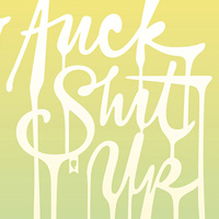
Gianni contacted me about doing a poster for his 3rd Annual Movember Poster Exhibition. He had already gotten confirmations from David Carson, Milton Glaser, Ben Bos, Andy Gilmore, Oliver Jeffers, The Stone Twins and Michael Bierut for participation in the show so I was happy to help out. 100% of…
Art of the Cap
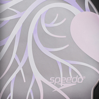
I love creating art for good causes and this partnership with Speedo was no exception. Every artist was assigned an amazing swimmer to create artwork for—in my case, Dana Vollmer, an olympic gold medalist who was able to have an outstanding career despite a heart condition that was corrected with…
Flash on the Beach
Now renamed “Reasons to Be Creative”. Three full days packed with amazing talks from the worlds best coders and designers. Expect lots of opportunities to mix and network with peers from over 30 countries. Expect to walk away inspired and invigorated and keen to get back to work to produce a…
Tilda
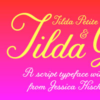
This typeface for Moonrise Kingdom set the tone for a sweet movie about youthful innocence. Inspired by director Wes Anderson’s quaint aesthetic and the titles from La Femme Infidéle (1969), Tilda is formally dressed, without hiding its raw, intentional naïveté. Unusual for a script typeface,…
Gratitude Journal Spot Illustrations

After the release of my two children’s books Tomorrow I’ll be Brave and Tomorrow I’ll be Kind, we wanted to bring the artwork and sentiments to a new audience. I am a “bad journaler” and have abandoned many a barely-started diary over the course of my life, but when I discovered gratitude…
Pretty Happy Feeling
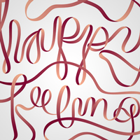
I don’t often participate in group shows (they’re awesome, but “gallery artist” isn’t currently something I aspire to be), but I couldn’t resist being a part of this one organized by friends at a great gallery in Portland. The show’s title is Love for Sale: Valentines Influenced by…
Inspire Conference
Ready to Inspire is a brand new conference about the craft of web design, type and code. It has workshops, live music, meetups and parties, but above all an exciting lineup of today's craftspeople and mind blowing new faces. We believe the group of speakers we have gathered will inspire you and get…
Guideposts Holiday
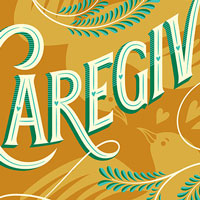
For Guideposts magazine’s Holiday Issue, I was commissioned to create the cover and five pieces of art for the interior which would act as chapter openers. Each piece reflects a central theme of the issue such as Christmas Baking and Caregiving. We were going for a classic holiday look which…
Southern Living
Robert Perino was in the middle of a major design overhaul of Southern Living when he contacted me to update the masthead. Jim Parkinson, a brilliant lettering artist, had created the most recent update in the mid-90s, but the design needed a bit of modernization to match where the magazine was…
Jacob’s Folly
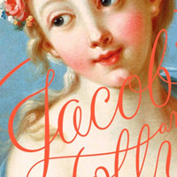
Jacob’s Folly is a rollicking, ingenious, saucy book that takes on desire, faith, love, acting—and reincarnation. The novel brims with sparkling, unexpected characters: Jacob, a Jewish peddler living in eighteenth-century France; Leslie and Deirdre Senzatimore, a settled American couple; Masha,…
Wash Your Hands
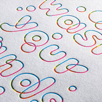
I’ve loved 20x200 ever since I as a wee baby designer and it was a pleasure to collaborate with them on a special edition print. They were organizing a series in early covid to have designers and artists create a limited edition 5"x7" print of the phrase “Wash Your Hands.” We worked with…
Aesop’s Fables
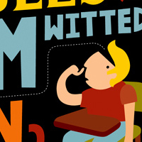
This is a children's book I developed while in school at Tyler School of Art. Each fable is illustrated along with the moral so your child doesn't even have to think about how the story applies to their life, it's right there in front of you. Almost every word over four letters long is defined in…
28 Days of Peace
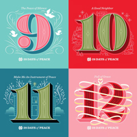
Notre Dame Alumni Association contacted me to work on this ambitious project—illustrating a countdown for Advent in which each number is unique and related to a daily reflection or action leading up to Christmas Day. The project is still wrapping up and I’ve been posting the letters in groups…
Harpers Bazaar Cover
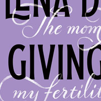
I am a big fan of Lena Dunham (rewatching Girls the week I write this) so I was naturally quite excited when Harpers contacted me to create the cover lettering for this issue. Fertility is a complex and emotional subject matter to design for—something that so many women struggle with and relate…
Beck: Song Reader
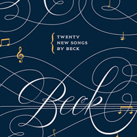
I walked into Atlas Café in San Francisco one afternoon to have a quick solo lunch and ran into Jordan and Walter from McSweeney’s who were scheming about what to do for the cover of Beck’s new “album” (a book of sheet music). By the end of lunch were doodling together and they signed me…
Academy Screenwriting Posters
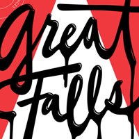
The Academy Nicholl Fellowships in Screenwriting is an international screenwriting competition established to identify and encourage talented new screenwriters. Thousands of scripts are submitted and only five winners are chosen. I was asked to create artwork for each of the five winners, which…
Title Case
Title Case is the collaborative studio of myself and Erik Marinovich in San Francisco. Together, we host workshops and events, teaching others about lettering and type and doing our part to bring the creative community of San Francisco together. To learn more about events at our space or if…
Farmhouse Conf
Farmhouse Conf 5 is the fifth and final show of Hollywood’s best backyard storytelling conference. 1 day / 1 track, 10 speakers (5 men / 5 women), no slides, no projectors. Amazing people telling incredible stories of Collapse. The event brings together people from a variety of backgrounds and…
Comfort and Joy
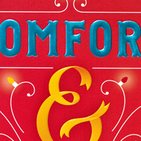
Cover for the US release of India Knight’s hit book Comfort and Joy. The direction was a little tough on this one—while the book is centered around one family’s experience and expectations of Christmas the publisher didn’t want it to be too “Christmassy” (though the end result ended up…
Cancelled Weddings
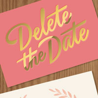
I love working for The New York Times, but this project for the Sunday Styles section was especially fun. I was asked to create artwork about what happens when you have to cancel your wedding. My thoughts immediately went to fancy wedding stationery, and I had a lot of fun both writing and…
Stand Out with Moo
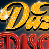
The agency Full Contact put together this series of ads for Moo, commissioning yours truly to create the illustrative lettering. These were very fun to work on, especially because it feels like its been ages since someone commissioned me to create more illustrative lettering work. Note: cellists, I…
Love Stamp
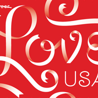
I am beyond excited to show off this stamp design I lettered! It's taken a while to be released, but the USPS just started previewing the 2012 designs! Happily, I think these will be out by the time I have to send out my own wedding invitations, which makes it an especially celebratory release!
Hallmark Signature
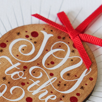
I partnered with Hallmark Signature to create a special artist-collaboration series of Christmas cards. Their Signature line is very special—they can use all sorts of techniques to make each card feel like a gift unto itself. I really loved the idea of each card becoming a permanent keepsake and…
AIGA Design Ranch
Design Ranch is an intimate, three-day, hands-on workshop-driven design retreat in a rustic setting on the banks of the Guadalupe River. Our workshops will rekindle your creative spark as they guide you through every facet of design and creative thinking.
52x52
52x52 is not a charity, it’s a group of people committed to helping others. Every week, 52x52.org highlights a different charity and call on you, those willing and happy to help others, to donate directly to that charity. Don’t feel like donating to one of the featured charities for whatever…
Inker Linker
As a letterpress loving designer, I’m asked all the time to recommend printers. While it might be easy to find a printer, finding the right printer for your job usually involves a mix of friend recommendations and blind luck. That’s where Inker Linker steps in. Find printers based on what they…
Gilda
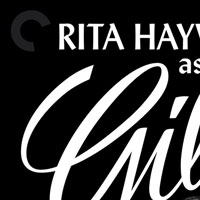
For the cover of Gilda, Eric wanted to use a still from the film with Rita Hayworth in all of her sassy glory. The lettering called for something “sophisticated but with a lust for life” so we looked at old hollywood / noir titles to draw inspiration. The end result is a vivacious brush script,…
A Spoonful of Sugar
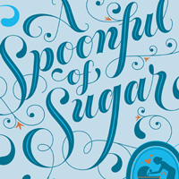
Brenda Ashford is the quintessential British nanny. Prim and proper, gentle and kind, she seems to have stepped straight out of Mary Poppins. For more than six decades Nanny Brenda swaddled, diapered, dressed, played with, sang to, cooked for, and looked after more than one hundred children. From…
Are You There God It’s Me, Margaret
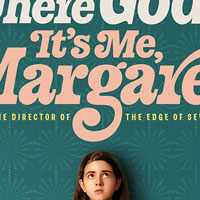
It was an absolute honor to collaborate with Lionsgate on the main title design for the film adaptation of Are You There God, It’s Me Margaret? The team at Lionsgate put the title design to good use at events—creating beautiful dimensional graphics—as well as activations like an International…
CAA Friday Night Party 2014
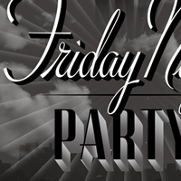
I was very excited when Thao contacted me to design the CAA Friday Night Party invitation for the second year in a row! The previous year’s design was inspired by The Great Gatsby, and this year’s by Old Hollywood. The decor of the party would be in various gray tones with pops of red, so I…
Cake Stencils
Anne Donnard, one of my favorite art directors and someone I’ve worked with a number of times contacted me to create some designs that would then be made into food-safe cake stencils. Of course I was super excited—if you know me at all you know I love cake. Here are all of the designs I…
Guerneville Bank Club
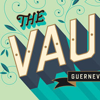
Guerneville Bank Club is a beautifully restored building in downtown Guerneville. Inside, you’ll find ice cream, pie, a lovely gallery, and curated shops. I created lettering and illustration for the interior and exterior of the building, which was painted and gold-leafed by the extraordinarily…
40 Days of Dating
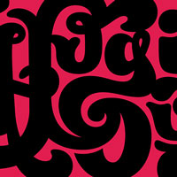
My friends Jessica Walsh and Timothy Goodman decided to create an experiment together—they would date each other for forty days and journal about it publicly so we could all follow along with their journey. They asked friends in the design community to contribute artwork to the site, which was…
10x16
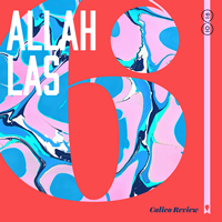
Erik Mortensen & Richard Perez do a project every year in which they make new album art for their top 10 albums of the year. This year, for 10x16 (last year was 10x15, the year before 10x14, and so on), they asked 19 different artists to contribute art, each creating 10 unique covers for their…
Love Stories
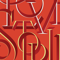
It is always a pleasure and privilege to work for The New York times but especially for the Book Review under the amazing Nicholas Blechman. This piece was for the cover of The Book Review, for an issue about love stories of various types. I wanted to create something with intertwined letterforms…
Love Stencil
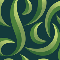
I made this bit of lettering for fun but ended up using it for a fun Valentine’s pop-up that Erik Marinovich and I put together. I letterpress printed this design along with one of his and we sat outside of a coffee shop in San Francisco giving them away for free. People were very confused about…
Party Nails 3D
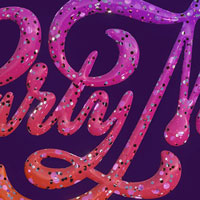
In the Spring of 2022, I decided to try my hand at learning 3D and specifically Blender. I created new pieces as well as bringing older pieces to life in a new dimension. I drew this logo for my friend Taylor Watson’s nail art pop-up way back when and was excited to see it come alive in the…
Type Hike
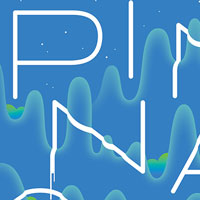
Back in 2016, James Walker and David Rygiol organized an exhibit called Type Hike in which 50+ artists created posters to represent each of America’s National Parks. This was all in celebration of the department’s Centennial anniversary. I designed a poster for Pinnacles National Park in…
DesignFest
DesignFest, by its size and number of international and foreign visitors, is the largest design event in Mexico. It joins academics and university students related to the design. Offers lectures and workshops given by renowned international designers.
Combat Covid
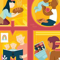
Bader AlAwadhi from Poster House spearheaded a collaboration with Print Magazine to create posters and other artworks as a PSA to keep folks home safe in the early stages of Covid. They worked with the city of New York to get advertising space to showcase the work all over the city including in…
Gratitude Journal Cover & Lettering
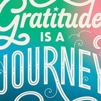
After the release of my two children’s books Tomorrow I’ll be Brave and Tomorrow I’ll be Kind, we wanted to bring the artwork and sentiments to a new audience. I am a “bad journaler” and have abandoned many a barely-started diary over the course of my life, but when I discovered gratitude…
Gap Remix
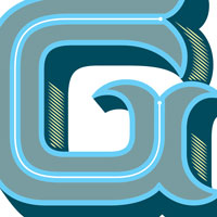
The REMIX Project is about bringing together artists to collaborate with GAP in creating a limited-edition graphic-tee collection. Artwork in the collection remixes the classic Gap logo t-shirt in bold art treatments that showcase the distinctive style of each artist. They made wonderful promo…
Tight 3D
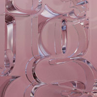
In the Spring of 2022, I decided to try my hand at learning 3D and specifically Blender. I created new pieces as well as bringing older pieces to life in a new dimension. This was a for-fun piece that I created initially as a letterpress print (which is available in my shop!) but that I have had…
This Podcast Will Kill You
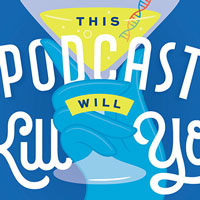
I haven’t made much fan art in my life because I’m generally busy enough with client work and personal projects, but I am such a fan of this podcast I felt moved to make something for it. If you love learning about human biology, diseases, etc, I highly recommend it! The two ladies who run the…
Bust DIY Guide to Life
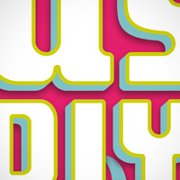
Cover for Bust Magazine’s book, the DIY Guide to Life. The illustrations reference stitching and the color palette is one of the brightest and funnest I’ve ever worked with.
FID
El FID nace como un festival de diseño transdisciplinar, un lugar de encuentro en que la creación contemporánea se hace presente durante 3 días de conferencias, talleres, exhibiciones y fiestas. Durante su primera edición, pasado marzo 2011, visitaron Costa Rica catorce renombrados…
Chopard Valentine’s
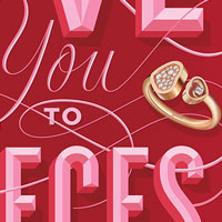
In the fall of 2019 I was commissioned to create artwork for Chopard’s 2020 Valentine’s Day campaign. We created three custom lettering treatments—each integrating one of the featured pieces of jewelry from the collection. The team at Chopard did a wonderful job animating the artwork for use…
We the People
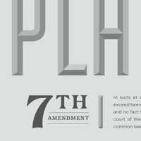
I was invited along with 9 other prominent designers to create a poster about one of the Amendments in the Bill of Rights. The posters would be displayed in an exhibition at Cooper Union and I was assigned the 7th Amendment. Other artists included Paul Buckley, Yue Chen, Seymour Chwast, Mark Fox…
Brand New 2018
A two-day event on corporate and brand identity with some of today’s most active and influential practitioners from around the world.
Chic Shopping Paris
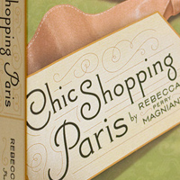
A boutiquey guidebook on shopping in Paris. The cover is a photograph that I took and then photoshopped to oblivion.
The New Rules of Design
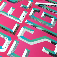
I was commissioned to create the cover for San Francisco Magazine’s design issue. I wanted to create something really fresh, that was (of course) lettering focused but also represented the various disciplines of people featured. I pulled textural photography from interior designers, architects,…
McKinsey New & Improved
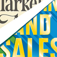
For this magazine cover, I wanted to show a transformation from something old-fashioned to something shiny, new, and modern. The modern lettering is being pasted up over the old-fashioned serif. This piece took a bit of inspiration from a cover I did for the Boston Globe and it was fun to revisit…
Greatness is Everywhere
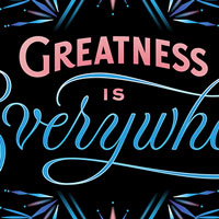
Saks Fifth Avenue hired me to create their 2019 Holiday campaign which included a logo, border elements, and ornaments. The campaign was timed with the release of Frozen 2, so the initial direction included tying the design in with the film through the use of the four elements—fire, water, wind,…
Church of the Dog
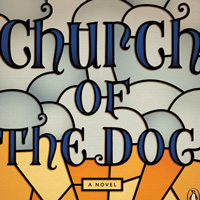
Deep in Oregon farm country, Edith and Earl McRae are looking down the barrel of their fiftieth anniversary with none of the joy such a milestone should hold. Instead, they are stuck in a past that holds them to heartbreak and tragedy. Enter the mysterious and ever-so-slightly magical Mara…
Some Recollections of a Busy Life
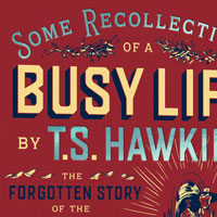
Dave Eggers commissioned me to create a cover for a personal project he would be self-publishing—a re-printing of his great-great grandfather’s out-of-print autobiography about traveling across America in a covered wagon and founding the town of Hollister, CA. Dave wrote the introduction, which…
A Tale of Two Cities
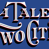
A cover created for Barnes & Noble's leather-bound series, which utilizes three foil colors on leatherette. Each book in this now large series uses similar design and production constraints so that they look wonderful together on the shelf. This design was ultimately simplified to two color for…
The Wonder Years
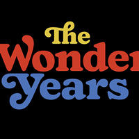
As an early 80s baby, I of course grew up watching the original Wonder Years, so when I was commissioned to create the main title / logotype for the reboot I nearly exploded with excitement. The new series centers around a Black family and the early explorations were in a more tubular / neon…
CAA Friday Night Party
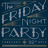
Thao Nguyen contacted me about designing the invite to CAA’s Friday Night Party after being sent my way by Brian Rea (thanks Brian!). They wanted something deco / flapper inspired as the party would have a bit of this theme thanks to the release of The Great Gatsby that year. I was also able to…
FrontEnd
Oslo’s web conference gathering the best speakers that live and breath web design and development.
You’ve Got the Spirit
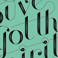
I was featured in Uppercase Magazine’s second issue and was asked to create a hand-lettered spread, anything I wanted. I chose this phrase, which was in a Destroyer song I had in my head at the time (and is also a lyric from a Joy Division song). I then translated the design into a vertical…
Semi-Permanent, Melbourne
Semi-Permanent is excited to be back in Melbourne for our fifth year. We have another exciting lineup of the worlds most creative professionals from a diverse variety of fields related to visual arts and design. Come and be inspired by creatives at the top of their careers, individuals who see art…
The Long Day Closes
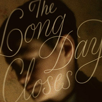
I’ve always wanted to do a Criterion cover so was really excited when Eric Skillman contacted me to work on the cover for The Long Day Closes by British filmmaker Terence Davies. The film was beautiful, subtle, and full of melancholy. I wanted to do something that captured the feel of the film…
Krai by Olga Bell
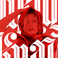
Olga Bell is an amazing musician (and dear friend! Love you, Olga!), so when she asked me to help out with some lettering for her new album I was of course on board. She needed a translated and cyrillic version of the title, which would print on the front and back sides of the album. Krai is…
SXSW Tote
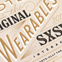
It’s always fun to design for people / products / things that you are already well acquainted with (and like!) so I was very happy when SXSW contacted me to design their tote bag for 2015’s Interactive festival. In our initial meeting, they showed me previous years’ tote bags and we talked…
Back Porch Country
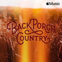
I was commissioned by Manual Design Studio in San Francisco on behalf of Apple to create artwork for a few Apple Music Playlists including this one for "Back Porch Country". We wanted to create something evocative of the music without being overly cartoonish or playing into stereotypes. The…
Won’t You Sing Along with Me
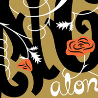
In early 2018 I was asked to participate in a group lettering show in Portland featuring so many great artists including Nick Misani, Gemma O’Brien, Brett Stenson, Mary Kate McDevitt, Mark Caneso and more. The show was happening during Portland Design Week and was to feature 26 lettering artists…
Village Voice Siren Fest
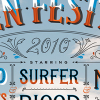
This was SUCH a fun project! John was very fun to work for and left the assignment incredibly open ended. I wanted to do something that related to the Coney Island location without being hit-you-over-the-head carnival type. I chose the cloud background because the event is outdoors and in the…
Colgate
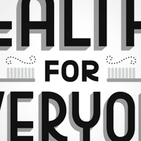
Young and Rubicam commissioned me to be a part of this really fun series of ads for Colgate. See below for full art direction and illustration credits.
SF Design Week
From their site: “Join the Pinterest design team and Jessica Hische for an evening of eating, drinking and making as we proudly join SF Design Week. We'll mingle over Pinteresty cocktails, appetizing treats and delightful conversation before Jessica demos her design process live, from initial…
Circles Conference
Come and reignite your passion and imagination at Circles Conference. Circles is a two-day gathering of creatives from around the world. Learn from world-changing thinkers and innovators in both the non-profit and creative community. Mingle with others who share the same passions you do! Topics…
Buenos Aires
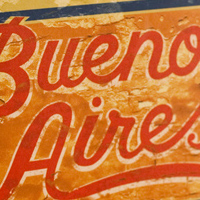
A guidebook for Buenos Aires. This hand-lettered cover was made to look as though it was painted on the side of a building in South America by the use of some photoshop trickery.
Family Tree
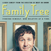
I was tickled when Karen Murphy contacted me about doing some work for Christopher Guest’s new HBO series “Family Tree”. The job called for a logotype and some type advising for the credits. After a few rounds of exploration we settled on a hand-lettered friendly sans-serif, which I paired…
Paris Chic & Trendy
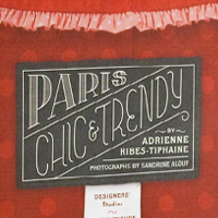
This was the first book I worked on for Louise and proved to be one of the most fun and challenging. All of the store titles (and the book title) were hand-lettered, and the photos arranged and cropped artfully to make for a beautiful book.
OFFF Barcelona
OFFF is an entity in continuous transformation, alive and evolutionary. More than a decade ago, it was born as a post-digital culture festival; a meeting place to host contemporary creation through an in depth programme of conferences, workshops and performances by the most relevant artists of our…
Jonathan Gold’s Best Restaurants 2016
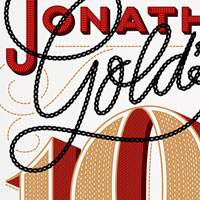
I created the opening artwork for the LA Times's annual dining guide in 2016, curated by their esteemed restaurant critic Jonathan Gold. I presented three concepts and the winner was inspired by the embroidery on a chef's jacket. We toyed with the idea of commissioning and photographing a custom…
Wake Forest New Frontier
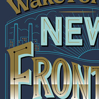
Creating a cover of a magazine is always such a thrill so I was of course excited to collaborate Wake Forest Magazine’s design team for this issue about the university’s recent investment in downtown Winston-Salem. They created a cultural hub and community known as Wake Forest Innovation…
Goode Co.
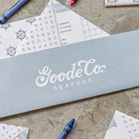
Principle reached out to me to help in their branding update of the renowned Houston restaurant chain Goode Co. (featured on Good Morning America, Food Network, BBC, etc.). It started as a very popular BBQ place and expanded to include 7 restaurants—Principle was tasked with reigning in the…
Augusten Burroughs
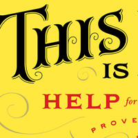
Cover for Augusten Burroughs’s book, This is How, Help for the Self... This was a really really fun book to work on for a few reasons: the title is ridiculously long, which means lots of opportunity to play with type and lettering, and it wasn’t a ladybook, which I had been doing a lot of at…
America: The Great Cookbook
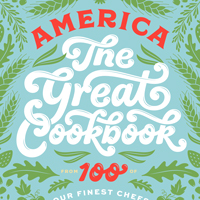
America: The Great Cookbook curates recipes and stories from illustrious chefs and is edited by Joe Ronan—two-time James Beard-winning Food and Dining editor for The Washington Post. I loved creating the art and endpapers for this beautifully produced book as well as contributing and printing a…
Live Laugh Love 3D
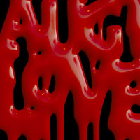
In the Spring of 2022, I decided to try my hand at learning 3D and specifically Blender. I created new pieces as well as bringing older pieces to life in a new dimension. Live Laugh Love is obviously a common phrase in hand-lettered home goods and I had fun creating this goth version—first in…
The End 3D
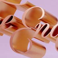
In the Spring of 2022, I decided to try my hand at learning 3D and specifically Blender. I created new pieces as well as bringing older pieces to life in a new dimension. I drew the phrase "The End" several times for a Google commission several years ago in styles that emulated the end title cards…
What's your favorite font?
You shouldn’t have a favorite font! If you have a favorite font it probably means you’re using it inappropriately. It’s easy to do, especially if you spend a few hundred dollars on an awesome typeface—you want to use it on everything in order to “get your money’s worth”. While you…
Should I Work for Free?
As a young designer (or any aged designer really), there are a lot of people that try to push you to do free work with the empty promise of exposure. I made this handy chart to help you figure out when working for free is justifiable and when clients should be showering you in cash.
Sandy & Baby Names
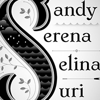
This was an illustration for an interesting article about how baby naming trends take shape. The article focussed on how names that start with the same letter or sound similar end up becoming popular simultaneously. The most fun part about his assignment though is how it was completed—Josh…
30 Covers in 30 Days
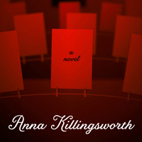
For National Novel Writing Month I was asked to contribute a cover for one of the selected featured pieces. Various designers are asked to participate and each are assigned a book to create a cover for. My book was about a struggling photographer that inherits her Aunt’s fortune under the…
Print 75
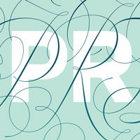
I was absolutely honored and humbled to be asked to create artwork for PRINT Magazine’s special 75th anniversary issue. Debbie Millman orchestrated and art directed the project, asking 75 notable designers and artists to create artwork using the word PRINT. They didn't run ever piece in the…
Summer Hair Guide
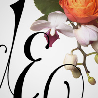
Lettered opener for More Magazine’s Summer Hair Guide for Grown Ups article. It was absolutely thrilling to work on this piece, and also a bit intimidating because Geof Kern's Photography for it was so good! I'm really pleased with how the final piece turned out.
Day-Ruining Invoices
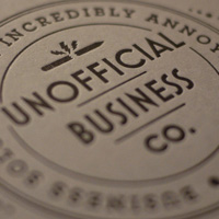
Letter-sized notepads full of tear-out-able sheets of the invoice for Services Rendered Day-Ruining. The covers are letter-pressed on 100lb Cover French Paper (Steel Blue from their "Construction" line) and the interiors are 2 color offset on 80lb ivory paper. They are bound with binders glue (for…
An Act of Kindness
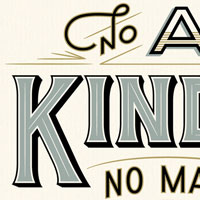
Comcast commissioned me to make this poster art for a special holiday film reuniting the one and only E.T. with Elliott and his earth family. Artists like myself were commissioned to make fun "Easter eggs" for the film's set decoration. The art direction was to create something timeless, classic,…
Elizabeth Warren Shirt
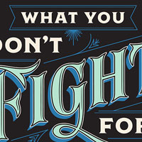
I am a huge fan of Elizabeth Warren and supported her in the 2020 Democratic primary election. I was quite excited when her campaign reached out to design a t-shirt to help fundraise for the campaign. The worked with exclusively female-identifying illustrators for the designs and turned them into…
Writer Shirts
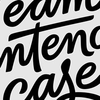
My good friend Pete commissioned me to create two shirt designs for an event that Writer was putting on. They wanted each in a very distinct writing style / voice and both needed to incorporate the Writer logo in a small and unassuming way. My old San Francisco studio that I shared with Erik…
Daily Drop Cap
In September of 2009, I started a little project that ended up having a dramatic impact on my career. For 12 alphabets, I illustrated a letter per day and posted them online for others’ viewing pleasure. At the peak of the project, the site was receiving more than 100,000 visitors per month. The…
Grantland Logotype
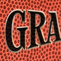
While I’m not really a sports enthusiast (unlike my brother, to whom sports are one of the essential elements of life, perhaps more important than water or shelter), I was still excited when McSweeney’s asked me to help design the logotype for a fancier hardbound quarterly version of popular…
Art with Heart
I did this piece pro-bono for this wonderful organization which attempts to "heal kids through creativity". I created two card designs which were printed on one page inside an activity book and perforated and scored for easy use. Many other awesome artists participated.
ICON Austin
The Illustration Conference is one of my favorite conferences. This year I’ll be participating in a panel with other female illustrators as well as conducting a lecture-style workshop.
The New Science of Old Whiskey
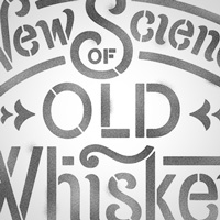
I had just returned from a Ladies Scotch Tour of Scotland, so was excited when The Atlantic contacted me to do a bit of editorial lettering for a piece about modern day whiskey makers. The visual inspiration came from spray-painted whiskey barrel stencils, though this version has a bit more pizzazz…
Help Ink
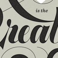
I love a good charitable art project. Drew Carson’s company Help Ink sells really rad art prints celebrating and encouraging the good side of human nature. Forty percent of the profits go to a charitable cause. I’m happy to be a part of their recent collaboration with Fab.com and hope that…
TDC 65th Anniversary
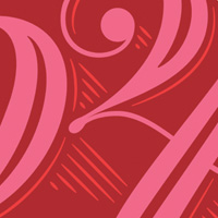
I was honored to be asked to be a part of the Type Directors Club project to celebrate 65 years of typographic excellence. They asked 65 graphic designers, letterers, and type designers to contribute one unique number, which would be used in a special book commemorating the event. The number I was…
Snacks Quarterly
Snacks Quarterly is a fun online publication that interviews creatives, giving them a list of silly (but interesting) questions and asking participants to create a piece of artwork to go alongside the interview. Since this was a for-fun project, I got a little weird with the artwork, creating it…
Help Ink Tee
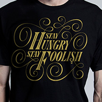
I loved working with Help Ink on an earlier poster and was excited when they launched a new endeavor selling t-shirts to raise money for charity. Drew had a handful of quotes he knew he wanted artists to create, and I chose Steve Job’s famous quote “Stay hungry, stay foolish.” The shirts are…
Wash Your Hands 3D
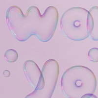
In the Spring of 2022, I decided to try my hand at learning 3D and specifically Blender. I created new pieces as well as bringing older pieces to life in a new dimension. I originally created this artwork as a letterpress print for 20x200—achieving the rainbow effect of the bubbles was…
The Messy Middle
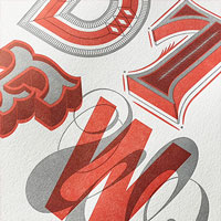
Scott Belsky reached out to create custom limited edition prints based on headlines in his book The Messy Middle. He and his publisher Penguin were organizing a sweepstakes in which readers could win a print or set of prints. We worked together to design the prints and then I hand printed them…
The Pâtisseries of Paris
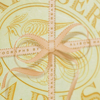
A lovely book about the pâtisserie shops of Paris. Ribbon, which was used on the cover, is used throughout the book as a decorative element.
Savoir Fare
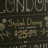
This guidebook for London focuses on inexpensive dining. The hand-lettered cover was made to look as though it was written on a chalkboard, emulating the menu boards of restaurants.
AIGA Chair
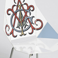
As a part of AIGA’s 100th Anniversary celebrations, the Walker asked a select group of designers to contribute a graphic for a Blu Dot Real Good Chair. The chairs would then be shown in an exhibition at both the National Design Conference and also at AIGA’s national headquarters in New York. I…
Obama Invitation
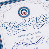
I was able to design the invitation to Barack Obama’s Election Night Party, which was held on the eve of the election to his second term. The design is relatively understated and utilizes embossing over offset to give the invites a more tactile feel.
New Style
I was approached by friend Wesley Verhoeve to create a logotype and monogram for the photography publishing imprint he was launching called “New Style.” He described it as “like an indie record label for photographers” and pointed to a few pieces I had created in the past that had a similar…
ACMA
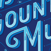
This is a cover and a series of ornaments that I created for the Academy of Country Music Awards program book. I’ve included my sketches for this project, since I (very briefly) owned a Cintiq (one of those Wacom screens you can draw on) and they look quite different than my usual pencil…
Desk Job
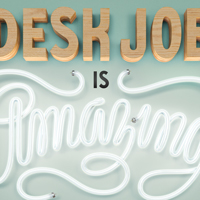
Wieden + Kennedy collaborated with the production company that put out An Inconvenient Truth, The Cove, and He Named Me Malala for a campaign celebrating blue collar work in America. I worked on lettering for the poster and the team at Wieden worked with 3d artists to turn my vector work into…
City Walks D.C.
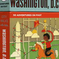
A deck of informative cards about Washington D.C. for kids. Each card had a map will fun illustrations and facts about what activities could be found in that particular section of the map. There are fifty cards (and illustrations) all together and is part of the City Walks for Kids series.
The Lolita Cover Project
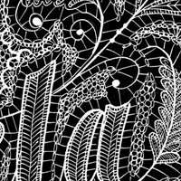
I was asked by John Bertram Architects to participate in a fun project. A wide variety of designers were asked to submit an alternate cover for Nabakov’s Lolita. This is my submission, the lace lettering used to represent something that can be construed as both hyper-sexual or innocent and…
Don’t Fear the Internet
Are you a print designer, photographer, fine-artist, or general creative person? Do you have a shitty website that you slapped together yourself in Dreamweaver in that ONE web design class that you took in college? Do you not have a site at all because you’ve been waiting two years for your…
Realtor Magazine
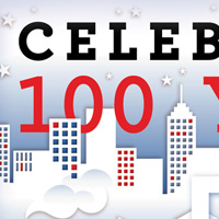
Cover for Realtor Magazine’s issue Celebrating 100 Years of the American Dream. It was really fun to work in a limited color palette for this one and it was one of the few pieces at the time that I did without utilizing textures. No lettering on this one either, just good ol’ Archer by H&FJ.
Biz & Livia Stone Foundation
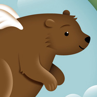
Logo for the Biz and Livia Stone Foundation. I was commissioned by Biz after being recommended by Meagan Fisher, who is an amazing web designer that was working on their site.
Reasons to: Design, Code & Create
Reasons to: is the award winning 3 day international conference with a festival vibe. It brings the very best international speakers from design and code to take to the stage and inspire, inform, entertain, thrill, teach, and network with web designers and coders that attend from all over the world.
Terroir Guides
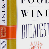
A series of in-depth travel guides. Because these books were very text heavy, our main focus was to make the text very beautifully set.
Buttermilk Font
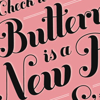
Buttermilk is a font I designed in 2009 which is available for purchase in my store, or at Veer and MyFonts. It was my very first typeface, so it definitely has its quirks, and it’s been use on everything from Holiday Barbie & Kellogg’s Special K packaging to ads for The Museum of Sex and…
Healthcare 50
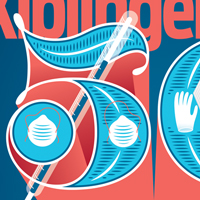
I was asked to design the cover for Kiplinger’s special Healthcare issue. The leading article listed helpful tips for saving on healthcare costs. The inspiration naturally came from the source material, and this was a fun one because the art director was looking for something that incorporated a…
Nuovo Femminismo
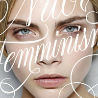
The fantastic editorial designer and art director Francesco Franchi commissioned me to create lettering for the cover of IL Magazine. Work for Francesco? Awesome. Make lettering that will be set over Cara Delevingne’s face? Double awesome. For an issue about feminism? Triple awesome.
Bridgerton
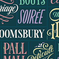
I was commissioned to create this piece for Netflix’s Tudum website when the new season of Bridgerton was premiering as an editorial illustration to accompany an article. It was fun to make this complex word cloud design—kind of like creating a grid of tiny logos.
The Cold Light of Mourning
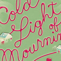
On her wedding day, Meg Wynne Thompson disappears between having a manicure and getting her hair done. The quiet Welsh town of Llanelen is stunned by a full police investigation, the arrest of Meg's fiancé, and the death of his father. But manicurist Penny Brannigan, an expatriate Canadian,…
Today is the Day
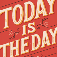
Lettering and design for a day planner released through Galison / Mudpuppy. This planner is great because it’s not specific to one year so you can start and stop it whenever you like! This little book is pretty awesome and full of so much pretty type and lettering.
The Whitehouse in Gingerbread
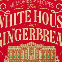
Pentagram was partnering with The White House Historical Association on a new reprinting of the book The Whitehouse In Gingerbread and commissioned me to create the cover artwork. They wanted it to be festive and cheerful with a classic holiday vibe. As a part of the cover, I also created an…
SOTA Certificate
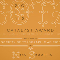
I was totally honored to be asked by SOTA to design the Catalyst Award certificate for 2012. SOTA (the Society of Typographic Aficionados) puts on Type Con, one of my favorite conferences and one of the nerdiest events you can attend. I developed an alphabet to be used in the border of the…
Stern Grove Festival
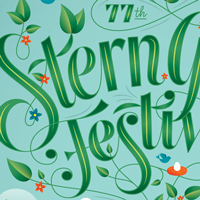
The Stern Grove Festival is an amazing free music festival in San Francisco that happens over the summer. The concerts take place every Sunday for several weeks in a beautiful tree grove — it’s a pretty surreal setting. I was stoked when Christopher brought me on board to help with the 2014…
America, it’s all...
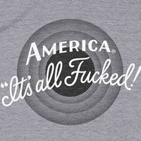
I’m a pretty optimistic person, but every now and then I go through a dark-thoughts period about the state of the world. This artwork was initially created as a sketch in Procreate as a form of art therapy when I was feeling crushed by everything that happened after Trump was elected President.…
Penguins!
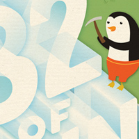
Cover, full page interior, and half page illustrations of many many happy penguins. Drawing penguins in bathing suits was pretty awesome, but the biggest challenge was making type out of ice! I feel like I could make it with my eyes closed now.
Royal Mail
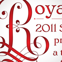
The Royal Mail commissioned me to do a piece for a specialty catalog they would be putting out to showcase some of their stamps. I have to admit, everyone else’s artwork is way more impressive than mine, but I did have a lot of fun working on this and it turned into a little mini typeface project.
Semi-Permanent 10
A few years ago I had the pleasure of speaking at two Semi-Permanent conferences in Sydney and Auckland. When they called up to see if I was interested in being a part of their 10-year celebration, I jumped at the chance. I also love projects where clients give you creative freedom, and this was…
Graphika Manila
Graphika Manila is the premiere multimedia and graphic design event in the Philippines. Since 2006, Graphika Manila has attracted over 10,000 design students and professionals and is now hailed as one of the most influential multimedia events in the country.
AIGA Jacksonville
Jessica Hische joins AIGA Jacksonville as keynote speaker and guest judge for the organization’s 25th Annual Portfolio Review. The event gives students and recent graduates from the region the opportunity to interact with local design professionals for feedback on their portfolios and advice for…
Re:Make
Re:Make is a conference and festival designed to celebrate and explore the creativity in all of us. On Friday, September 11th, Brit + Co will host its third annual invitation-only conference about how creativity and technology are changing our daily lives, from our hobbies to our work. You’ll…
Adobe Max
Adobe Max is a three day festival with hundreds of sessions, labs, and creativity workshops, organized into six tracks: Creative Careers, Digital Publishing, Graphic Design & Illustration, Photography & Creative Imaging, Video, and Web & App Design.
Kiplinger Cover
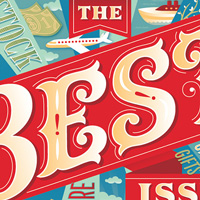
I haven’t been doing a ton of editorial lettering lately because I’ve found that letterers are often only hired for giant suites of work (as opposed to one-off illustrations). I was happy when Kiplinger’s contacted me to do a cover for them, and had a lot of fun going to town with the very…
Golf Guru
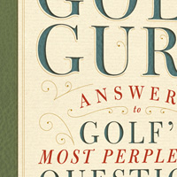
Quirk Books is a small publishing company in Philadelphia, and I interned there when still in school. I was happy when, a few years later, they contacted me to design this book. The content was really fun to design with, as much of the book was in a question/answer format, so I made sure to pick a…
Barnes & Noble Classics
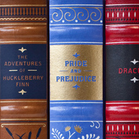
A series covers of classic books. The books were leather bound and the design was then foil stamped in two foil colors onto the full jacket and spine. This is probably my favorite project of all time and thanks to Jo the interiors are as beautiful as the covers. Each has marbled endpapers, painted…
Heartwork
Heartwork is a program that raises money for art supplies for kids who are staying at Target House and getting treatment at St. Jude Children’s Research Hospital. Each year, Target curates a group of artists to participate and asks each of them to create and donate artwork based on a theme. This…
Sam & Jessica
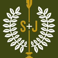
Friend and Russ’s facebook coworker Sam Lessin asked me to help out with some branding for his field-day themed wedding! I loved the idea of getting together with family and doing scout-like activities. These are a few explorations I did for a monogram for the two of them, and I believe they used…
I Love Voting Early
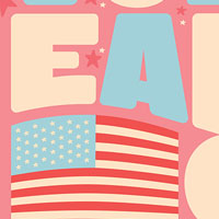
I believe I became aware of the #artofvotingearly grassroots campaign through my friend and fellow lettering artist/illustrator Mike Perry. The purpose of the campaign was to encourage folks to vote as early as possible to ensure a smooth election. Artists committed to voting early themselves,…
Melt the Guns
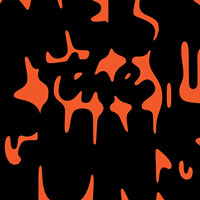
I made this piece in response to the endless unnecessary violence that occurs every day in America due to our country’s obsession with firearms and the right to own and openly carry a gun. I grew up in rural America and understand the need for some people to own certain kinds of guns for animal…
California Pizza Kitchen
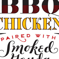
Lettering for ads for California Pizza Kitchen. The lettering was placed on a photo where a missing slice of pizza should be. I love these, and who doesn’t love pizza?
Tomorrow I’ll be Brave Tour
Between late 2018 and mid 2019 I traveled all over the U.S. doing lectures and events related to my kids book. Cities visited included Los Angeles, Seattle, New York, Boston, Providence, Chicago, Milwaukee, Kansas City, Omaha, Austin, Houston, New Orleans, Dallas, Raleigh, Nashville, Memphis,…
Big Jewish Book for Jews
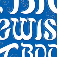
Client: Penguin Books // Art Direction: Lucia Kim // A book cover that hints at the visual language of The Dangerous Book for Boys (and the "for Girls" counterpart) but for a much sillier premise
Boston in Winter
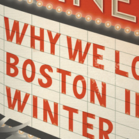
Covers for the Boston Globe’s “G” Magazine. I had to illustrate the phrase “Why we love Boston in winter” in six different ways which ran on six consecutive days. Each cover dealt with a different topic, from excellent wintery foods to where to go on a winter date night.
Squad Goals
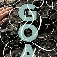
Sports Illustrated reached out to create lettering for a feature in their annual Swimsuit issue. The feature was about players from the US Women’s Soccer team and they wanted to convey boldness and elegance—that strength and femininity can co-exist. The AD was inspired by another piece I had…
Alaska Lettering
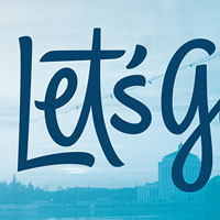
I collaborated with the creative agency Hornall Anderson and Alaska Airlines to create a suite of brand phrases for use internally at Alaska. We developed a brand style—a brush script that was inspired by the logotype but had a fresh bounciness to it, and created dozens of phrases in multiple…
Jane Eyre for Audible
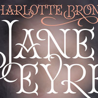
For this “book cover” for a special Audible release, we wanted to make the type overlay a blurry screened back image (with smoke alluding to a plot point in the story—no spoilers!). I am really in love with the Antimatter Series by Miaz Brothers, though an image that blurry wouldn't quite…
Florence and the Machine
As a part of Florence and the Machine’s North American tour, MSN commissioned several artists to make a special edition poster based on a song / lyrics from the band. The song I chose was Cosmic Love and the lyric is “You left me in the dark.” The poster was printed 3 color screen print, a…
Paperless Post
I am so excited about this new partnership with Paperless Post! I’ve been a fan of their service since it started and have had a ton of fun working with them so far. I’ll be posting new work on an ongoing basis so make sure you check back often for new designs! If you have a wedding coming up…
Dandy Gilver
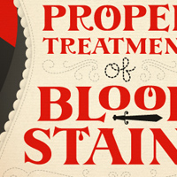
Jacket designs for a series of murder mystery books. I really love designing books where the full jacket is taken into consideration. Often, as a letterer, I'm brought in to do a component on a cover but not the full design. I thought this was a fun and whimsical way to really activate the whole…
Buzzwords of 2012
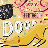
When the New York Times contacted me this year to do the Buzzwords of 2012, I was jazzed because I thought it was a perfect excuse to collaborate with my studio mate! He and I each did a sketch and then took turns working toward the final from the chosen sketch. I think it turned out great, and you…
Indianapolis Monthly
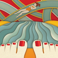
Full page illustrations for Indianapolis Monthly, the first for an article about a grown woman who visits a water park and the second is an insider’s guide to Indianapolis.
Winx
I was commissioned to create this piece for Netflix’s Tudum website when the new season of Winx was premiering as an editorial illustration to accompany an article. It was fun to make this complex word cloud design and mix and match several witchy / mystical styles.
Retail Me Not
Paravel, a wonderful digital agency in Austin, was working on an overhaul of the online coupon site Retail Me Not. They already had the website overhaul well underway but needed to bring in an expert to update the company’s logo. This was an incredibly fun but also challenging project. It was…
Eventbrite
The folks at Eventbrite had seen the logo update for MailChimp and contacted me to give one of their marks a similar facelift. This is their “signature logo”, which they use from time to time, usually at a small scale. I definitely kept that use in mind when working on the update.
Red Cross Poster
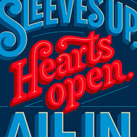
The American Red Cross has a couple of phrases they use to describe their work and inspire their volunteers, employees, and supporters. Sleeves up. Hearts open. All In. Is one of them. They were looking to commission hand-lettered illustrations of these phrases to use in both print and digital…
Caramel Twist 3D
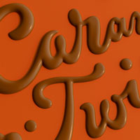
In the Spring of 2022, I decided to try my hand at learning 3D and specifically Blender. I created new pieces as well as bringing older pieces to life in a new dimension. This lettering was originally created for an Eagle Brand advertising campaign and I had, at the time, simulated a 3d look in…
GTFO
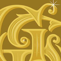
I created this piece for fun in what is meant to be a series of internet acronym monograms. Several years ago I was commissioned by Papyrus to create an OMG card, which I treated as a fancy monogram, and it sparked an interest in taking other common internet-age (or texting age?) acronyms and fancy…
Spread Kindness
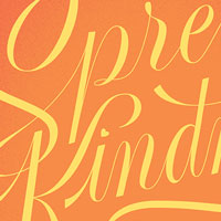
I created this piece of art to send as a special gift for folks who pre-ordered my children’s book Tomorrow I’ll be Kind. It features the main characters from the book in a warm embrace and is set in the beautiful sunset palette of the book. The art was printed by Moo in their Luxe 6x9"…
Perception
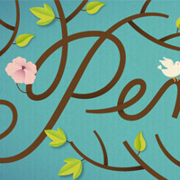
Illustration for Smithsonian Magazine’s Perception section. This illustration was used alongside a very descriptive essay about a stroll through nature.
OnStar
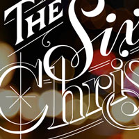
This piece accompanied an advertorial article for OnStar (subject obvious). My goal was to keep the lettering monochromatic so it could be placed over a dark photographic background and to give it a vintage holiday card feeling.
Oxfam Holiday
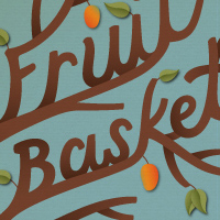
Oxfam is a wonderful organization that encourages people to buy charitable gifts on the behalf of others. This campaign was for their 2011 holiday season and the ads were displayed on everything from bus shelters to magazines. It was particularly fun to see the ads, printed enormously, in airports…
In Control
Spend two content-rich days with some of the most forward-thinking Designers and Developer building today’s Web. Limited enrollment and longer sessions allow for more meaningful interaction with our expert speakers and fellow attendees. Join us to expand your skill set and use updated techniques…
Kerning Conference
Kerning is the first international conference in Italy dedicated solely to typography and web typography. On June 5th (only workshops) and 6th (conference day) 2014 we will gather in Faenza, in the very heart of Italy, top notch speakers from the whole world of digital and web typography to create…
Viney Alphabet
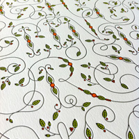
I created this fun viney alphabet for a letterpress print, which I printed myself and are available in my store. I also decided to make it into a repeat pattern for fun, which has been my twitter background for some time.
New Jersey Monthly
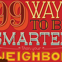
This was a really fun assignment and one of my first major illustrative lettering assignments. I was hired to do a typographic cover for the magazine as well as headline type for the cover story article and a full page illustration. The article intended to up your New Jersey smarts but illuminating…
Sports Illustrated Kids
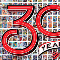
Sports Illustrated Kids reached out to design custom lettering for a main feature celebrating the 30th anniversary of the magazine. The lettering was overlaid on top of an image of every cover. The real challenge with this piece was making something that stood out against a busy background but…
Bertolli Pasta
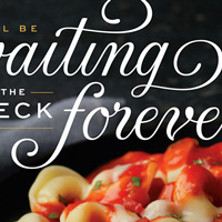
I had a blast working with DDB on these ads for Bertolli. We spent the first bit of the project honing the style of the lettering and then worked to keep it consistent throughout the campaign. The result is elegant and eye-catching without being overly decorative.
100 Things We Learned From Mom
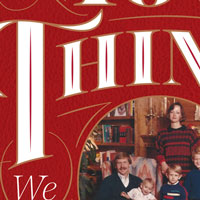
I’m not big on personal commissions but of course love doing work for close friends and especially family. When my Mother-in-Law turned 70, her three boys (all of whom are designers / design adjacent) put together a little book of insights and memories she had given them throughout the years. My…
Prefontaine
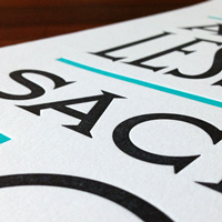
When Dan Provost contacted me to see if I’d help him raise some money for cancer research I was all over it. Dan was going to run the NYC Marathon, but after it was cancelled because of Hurricane Sandy, he ran the Philadelphia Marathon instead. Proceeds from poster sales go to both the Memorial…
Haus Holiday
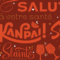
Haus, a boutique D2C aperitif company, commissioned several artists to create custom packaging for a 2019 holiday campaign. I love wonderful unboxing experiences and wanted my package to feel like a beautifully gift wrapped box. I created a repeat pattern from the word for “cheers” drawn in…
The Night Circus
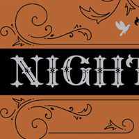
This is unfortunately a killed project as I was really loving the direction! The art director and I had grandiose plans to use all kinds of foils and fancy materials, but sadly the author and publisher went in another direction. Nevertheless I’m happy to share the two presented options with you…
In Radiolab We Trust
Jez Burrows started a wonderful little initiative to help support Radiolab, which is an amazing podcast. I was happy to be a part of it! My contribution references my favorite episode, which is about Parasites. I decided to make a pattern of the bird just for fun.
Weekend Art Workshop
Tyler School of Art, my alma mater, commissioned me to create this poster for their continuing education program's Weekend Art Workshops. This was one of the first pieces I created after graduating college, and is one of the very first in which I illustrated in what has now become my main…
Watkins College of Art, Design & Film
The Watkins Visiting Artists Series is an annual yearlong program that welcomes nationally and internationally recognized fine artists, designers, filmmakers, educators and critics to the campus and the community. This will be the first of two talks I give in Nashville, they will be different talks…
Mohawk Quarterly
This lettering was created as a poster insert for Mohawk Quarterly. Hybrid hired me to illustrate this Wes Anderson quote as I had worked for him on the Moonrise Kingdom titles and it was a fun tie in. We kept the color scheme relatively monochromatic, and the poster was printed with a metallic…
8 Faces Magazine
Cover for 8 Faces, a Magazine founded by Elliot Jay Stocks which explores people’s “desert island” typefaces. Each issue features lists curated by different people and for this issue I chose to make monograms for each person asked to contribute. The cover is pretty glorious to behold, 2 color…
Jeni’s Ice Cream
I was already a fan of Jeni’s when Patrick reached out about helping them update their branding. Aside from wanting to generally tighten up the logo, there were some very specific (slightly hilarious) asks—one problem with the logo was that some people accidentally misread it as a certain male…
Good Stuff 3D
In the Spring of 2022, I decided to try my hand at learning 3D and specifically Blender. I created new pieces as well as bringing older pieces to life in a new dimension. This piece of lettering was originally created to cut on my laser cutter for a box inlay (just for fun!) but I love the…
Southern Living
Full-page illustration for the Southern Living Holiday Gift Guide. I also created ornaments and borders to match the opener that were sprinkled throughout the article.
Private Schools
Full page illustration plus several smaller illustrations for an article titled “The Best Private Schools”. Each of the smaller illustrations dealt with a specific kind of Private school including All Girls, All Boys, Parochial, Preparatory, and Very Small.
Golf Digest
Hand-lettered titles for a story about the best golf resorts in North America. Another illustrator was hired to do oil paintings of the various resorts which were then combined with my hand lettering to make excellent vintage golf poster illustrations for the magazine.
Type or Glory
You could imagine how intimidated I was when the TDC asked me if I wanted to design their 2012/2013 keepsake. The turnaround was quite tight, but I was really happy with how this turned out. The keepsake is two parts, a beautiful letterpressed postcard and a temporary tattoo of the TDC monogram.…
Q.Bel Chocolate
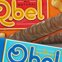
Chocolate label and box design for a wonderful company that specializes in delicious natural chocolates.
Alaska Design Forum
I’ll be touring around Alaska for a week this March, making three stops for speaking engagements! I’ll be speaking on my process and showing recent projects along with all the educational nuggets I can inject into an hour-long lecture. Juneau: Gold Town Nickelodeon, 6pm Fairbanks: The Blue…
AIGA National Conference
The AIGA Design Conference is the biggest event of the year for creatives from all across the country. Be there as the design community comes together for provocative speakers, nightly networking receptions, live competitions, exhilarating exhibitions, innovative professional development sessions,…
Alt Summit
Alt Summit was founded in 2009. Since then, there have been 14 major events — seven flagship conferences in Salt Lake City, two flagship conferences in Palm Springs, two summer conferences in New York, one summer conference in San Francisco, and two more summer events in Salt Lake City.The…
Fortune 50
Fortune contacted me to create a giant “50” for their upcoming issue about the 50 most powerful women. Since the timeline was tight, and the layout wasn’t totally nailed down yet, we decided to create two versions—one that was more fancy and feminine and one that was more modern /…
Everything is Design
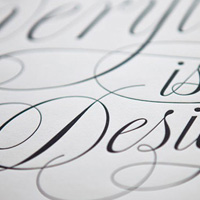
Josh Higgins asked me to be a part of a project to help celebrate the life of Doyald Young after his passing and of course I jumped at the chance! Doyald was an incredible inspiration to me and of course countless other designers and letterers. These posters were letterpressed and then sold on Etsy…
We Love Graphic Design
We Love Graphic Design is a celebration of the world of graphic design in the shape of an annual one day seminar featuring lectures from some of the most important, inspirational and insanely creative graphic designers working today.
World’s Strongest Man
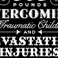
Design for a very long headline for Men’s Journal utilizing several fonts as well as some of my own lettering.
Virtue
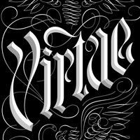
The Baffler is a quarterly journal of cultural and political analysis which was started in 1988 but revamped and redesigned recently. For this issue, I was assigned a featured called "The Politics of Virtue" and created this piece of lettering as full page art. The lettering needed to anchor the…
Family Matters
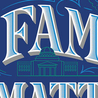
The Texas A&M Foundation commissioned me to make the opening artwork for a story about managing money and inheritance within families. It appeared in their Spirit of Sharing magazine and incorporates illustrated elements from the campus alongside classic type styles and elegant flourishes.
MailChimp
When Ron from Mail Chimp contacted me about helping them out on a logo revise I was totally tickled pink. Mail Chimp has been a wonderful supporter of the design community and I’ve been a happy user of their service for years. Here you’ll see a detailed look into the process of revising the…
Github Passion Projects
Julie Ann Horvath is a badass. She’s a lady, she codes, she set up Passion Projects at Github, which is a series of talks by inspiring women. She asked me to help with the logo design and then later to brand a conference in a similar style and I was of course on board. I was also happy to…
United Pixel Workers
United Pixel Workers puts out limited edition awesome t-shirts designed by design nerds. This was my contribution and I wear it constantly.
Papyrus Valentines
I had the pleasure of creating a big collection of work for Papyrus as a part of their 2018 Valentine's line. These designs were put onto bags of various sizes, wrapping paper, gift card holders—you name it. And of course, because it's Papyrus, everything was executed amazingly with velvet…
The Queen’s 90th
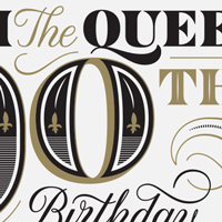
This was one of the crazier projects I’ve ever worked on—the Royal Mail was putting out a set of commemorative stamps in celebration of the Queen's 90th birthday and I was asked to create a bunch of lettering and ornaments that could be used on the package. Never in a million years would a…
Malcolm X Elementary Shirt 2023
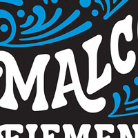
For our school’s 2023 fundraiser shirt, the PTA reached directly out to me and a few other parents who had designed shirts in the past to solicit designs. Instead of each of us coming up with our own design, we decided to collaborate! I created the lettering on this piece and fellow parent Lee…
Writing & Teaching
The approach of using subpages for storing content sections of a page can also be very useful for creating a one-page website, featuring very different kinds of content.
Kung-Fu Bikini Creatures
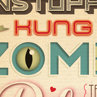
This assignment was incredibly fun—I had to illustrate an article about badmovies.org, which is an online database of useful info and fun articles about budget horror and action movies.
Bonds Holiday
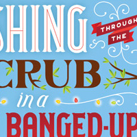
Wrapping paper design for a Bonds mailer. Jingle bells is revamped to suit the Aussie summer heat near christmas, complete with native fauna in underoos and kangaroos on surfboards.
WeMake Portland
Born from the idea of creating a platform that fosters art and design within our community through hands-on experiences, workshops and design in action initiatives. WeMake hosts sketchXchange a monthly night of inspiration and drawing and a chance to peep into the sketchbooks of some of…
Lipscomb University
The Lipscomb University Art Department will host me in its Presidential Lectureship for Art and Art History on Jan. 23. The lecture will take place in the Ward Lecture Hall. Reception at 5pm in the John C. Hutcheson Gallery, talk at 6pm! The talk will be an in-depth look into my process, with tons…
Beringer Monogram
In 2010, I worked with YARD to create a monogram for Beringer based on historical sources from the winery’s past. It’s been wonderful to see how the company has utilized the design over the years, and how well it has paired with their sophisticated label design.
The Kissing Game
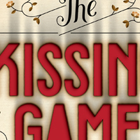
Cover for a book of short stories about teenage defiance. This cover was really fun to work on and pretty tricky to execute. Faking the burnt type turned out to be more challenging than I originally thought but I couldn’t be happier with how it turned out!
Society of Design
The Society of Design in Pennsylvania put together this epic invite in which they ordered custom vanity license plates to spell out a message to me (and now drive around with them on their cars!) to get me to come out and do a talk. Of course I said yes!
Design Boom
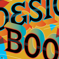
Full page lettering and numbers to accompany an article about creatives bringing an indie spirit to mainstream design. I also happened to be one of the featured “visionaries” in the article!
Dagmar Studios
Helena Price is a dear friend and very talented photographer. We’ve worked together on a few projects (most recently The Pussy Project branding) so when she reached out about having me create a logo for her new creative studio I was all in. The brief was very open, but she wanted something bold…
Starbucks
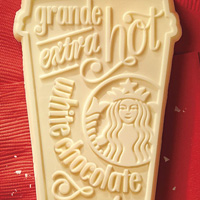
This series of ads for Starbucks was really fun—I love seeing my lettering made into physical things (especially when those things are delicious!).
Visit Orlando
Visit Orlando was creating a new campaign called “The Never Ending Story”—photography would be combined with text to create storybook-esque layouts. I was commissioned to create a custom illustrative alphabet for the campaign—the letters had to be decorative and feel fun and “magical”…
Alice in Wonderland
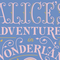
A cover created for Barnes & Noble's leather-bound series, which utilizes two foil colors on leatherette. Each book in this now large series uses similar design and production constraints (two-color foil, similarly detailed borders, and a consistent typeface for the author) so that they look…
The Art of Harry Potter
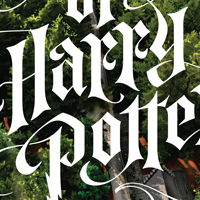
Insight Editions released a very deluxe book featuring all the concept art from the films. I was chosen to create the lettering for the cover, which as embossed and printed with a lightly holographic UV gloss. The book is huge and beautiful, and as a fan of the books and films it was an honor to be…
Girl Scouts BFF
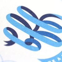
Alexander Isley and his team have worked with The Girl Scouts on many many wonderful projects. For this anti-bullying campaign, BFF: Be a Friend First, I worked with them to create a monogram, lettering, and ornaments. The materials produced included a friendship bracelet, which is SUPER COOL!
New 3D
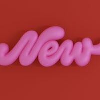
In the Spring of 2022, I decided to try my hand at learning 3D and specifically Blender. I created new pieces as well as bringing older pieces to life in a new dimension. This is one of my early experiments—I drew the word "new" in a style that I knew would translate well to a soft 3D style. I…
I Made Change
IMG Fashion Events and Properties partnered with Visa to create an activation during New York Fashion Week. They commissioned me to make art for a custom designed sticker which attendees received after donating to various female-based charities at the event.
Vote Lasercut
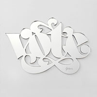
In an effort to help get out the vote as the election neared, I created a contest on my Instagram account to win this one of these custom lasercut pieces of art. To enter the contest, you had to tag #riseupshowupunite, the grassroots effort I started with Adé Hogue, point people to vote.org, and…
Writing
The approach of using subpages for storing content sections of a page can also be very useful for creating a one-page website, featuring very different kinds of content.
Bon Appetit
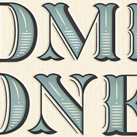
Editorial illustration for an article about prepaying a dinner that you have out at a restaurant. The art direction was to make it “fantastical and beautiful”.
Harvard Business Review
Various illustrations for Harvard business review for articles about how gamers make better employees, personal limits on cheating, debt education, and more.
8 Faces Poster
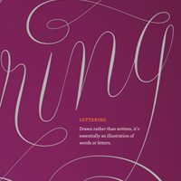
Over the course of a year, 8 faces is releasing eight A3 (297mm x 420mm) artwork prints, each one limited to 100 individually-numbered editions. I created the second in the series, which is pretty and informative
Wyatt Cenac’s Brooklyn
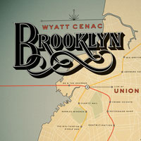
Wyatt Cenac recorded a live comedy album at Union Hall in Brooklyn—much of the content of the show had to do with the borough itself—poking fun at its embracing of artisanal everything, talking of his family’s history in Crown Heights, etc. It was a great show (I was able to attend the…
Samsung Korea
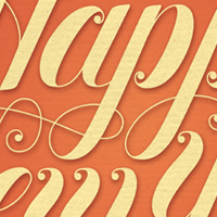
Giftcards for all occasions for Samsung Korea. Some called for lettering and some illustration but they all needed to work together. The end result was pretty thrilling to see, though I’m sad these aren’t available state-side.
AIGA Fresh Dialogue
The future of fonts as we know them is ever-changing. To help prognosticate, we're collecting some of the industry's leaders and asking them to explain what's coming next, why and how it will effect our everyday. We'll touch on lettering, foundries, collectives, technology and applications as well…
Oprah’s 15 Things
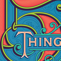
To celebrate O Magazine’s 15th year of publication, a number of awesome illustrators and letterers were hired to create artwork for a feature article “15 Things We Know for Sure”. I created the opening full page artwork, and had a ton of fun making a bold, colorful, vintage inspired design.
Pictory Mag
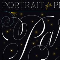
Pictory is a showcase for people around the world to document their lives and cultures. Anyone can submit one large, captioned image to each of Pictory’s editorial themes. This is a headline I lettered for one of the themes, a portrait of Paris through pictures.
Caramel Twist
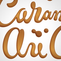
Lettering for an advertisement that was later made to look like it was drawn in caramel. I mocked it up here, but for the final ad another illustrator dealt with the caramel effect.
The Metamorphosis
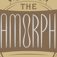
A cover created for Barnes & Noble's leather-bound series, which utilizes two foil colors on leatherette. Each book in this now large series uses similar design and production constraints (two-color foil, similarly detailed borders, and a consistent typeface for the author) so that they look…
Dream a Little Dream
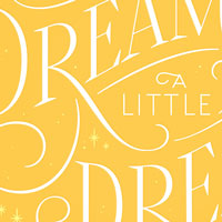
Literati included Tomorrow I’ll be Brave as one of their chosen books for their wonderful books-by-mail service. The month it was included, they commissioned me to make this piece of artwork to be shipped along with the books which was printed on a beautiful shimmery paper.
Teaching
The approach of using subpages for storing content sections of a page can also be very useful for creating a one-page website, featuring very different kinds of content.
Speaking
As you can probably tell from my thoughts and resources pages, I love to share what knowledge I have to whomever will listen. I’ve had the honor of sharing the stage with the likes of Michael Bierut, Stefan Sagmeister, Paula Scher, James Victore, and Erik Spiekermann at design, web, type, and…
Generation X Parents
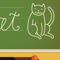
Editorial illustration about Gen X parents, how over-involved they are in their children’s lives, and how teachers deal with them. (One of the kids’ names is Siouxsie. Just thought I’d throw that out there.)
GTAA Annual Report

I was commissioned to do these illustrations for the Greater Toronto Airports Authority’s annual report. The direction was fun and simple based on the overall concept of “smart connections”—create juxtaposing images that would work together across spreads.
Nobel Prize
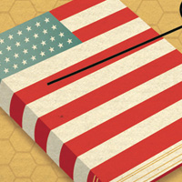
An editorial illustration for The New York Times about whether or not European literature is superior to American Literature after a controversial comment was released by one of the Nobel Prize judges.
Summer Reading Issue
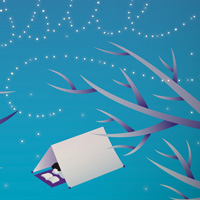
A really fun cover for the Washington Post’s Summer Reading Issue. This makes me long for indian summers and fireflies in Pennsylvania.
Scientists & Creationism
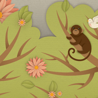
An illustration for an article about a group of scientists that visit the Creation Museum in Petersburg Kentucky.
Wired Magazine
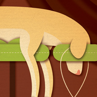
Various illustrations for Wired Magazine for articles about a fancy dog hotel, a jedi training class in lower manhattan, the NFL archives, and a guy who answers every spam email he gets for a week.
Maryland SPCA Campaign
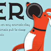
Logo and art for a fund-raising campaign for the Maryland SPCA. This was a fun project that involved a ton of hand-lettering and actually inspired me to adopt two kitties of my very own.
Culinary Culture
Logo and illustrations for culinaryculture.com, a social networking site and recipe database for true foodies.
The Knight Life
Illustrated poster to promote the residential life program of Arcadia University in Pennsylvania. The illustration was also used on other promotional materials.
You’re So Screwed
I was asked to participate in a calendar for a project run by fellow letterer Luke Lucas. His side-project Life Lounge put out a series called Some Type of Wonderful in which 12 letterers were asked to contribute a design for every month. Mine was for the month of July, and while July is winter for…
American Craft Council
“Present Tense” is the 12th national conference of the American Craft Council. The convening’s function is to locate, through the interchange of ideas, the place of craft in our contemporary moment. For two and a half days, join the ACC for a convening of moderated conversations between…
Salute the Reuser
I found out about the company Keep Cup on a trip to Australia and just fell in love with their product line. When Andy contacted me about doing a bit of work for a Keep Cup ad campaign it felt like the planets had aligned. These were my contributions to the campaign, but they also worked with a…
50 and 50
50 and 50, a.k.a. The State Mottos Project, was started up by Dan Cassaro, a.k.a. Young Jerks. Fifty designers, one per state, illustrates their state motto, creating something steeped in history but completely modern and unique: a kind of designer’s atlas. I happily illustrated the motto for my…
AIGA Think Tank
Every year, AIGA Nashville builds a power-packed day filled with unrivaled industry talent and the most innovative and thought-stirring content. Attendees will be treated to world-class presentations, catered lunch and a roundtable discussion where the audience has the opportunity to ask questions…
Harry Potter
I was thrilled with Entertainment Weekly gave me a ring to create some artwork for their special Harry Potter issue, which was to be released at the same time as the final movie’s release. I’m a huge fan of the Harry Potter series! I made monograms for each of the main characters as well as a…
Long Live the Oceans!
Full page ad which ran in the New York times to promote the movie "Acid Test" which deals with the environmental troubles the ocean is experiencing and hopes to motivate viewers to consider the oceans as well as they take steps toward living greener lives.
Women in Power 2019
Globe Magazine contacted me to create the cover lettering for their Women and Power issue. I worked in a style that felt bold and strong but still feminine. While the issue isn’t entirely about financial power, we didn’t shy away from it through the use of a green palette and engraved serif style.
Contact Energy
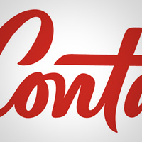
Olivia from Design Works contacted me to assist in a rebrand for Contact Energy—one of New Zealand’s leading brands. They wanted something that had a touch of history but was still modern and forward thinking. The end result is a brush script that has a lot of energy unto itself and here you…
The Awakening
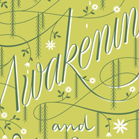
A cover created for Barnes & Noble's leather-bound series, which utilizes two foil colors on leatherette. Each book in this now large series uses similar design and production constraints (two-color foil, similarly detailed borders, and a consistent typeface for the author) so that they look…
Beautiful / Decay
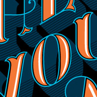
I was asked by Beautiful / Decay, an art publication, to submit a t-shirt design for their Fall line of shirts and this was the result. I was really stoked with how this turned out.
Color Factory
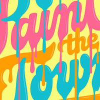
When Color Factory opened in San Francisco, creator Jordan Ferney organized a curated “color walk” in the surrounding neighborhood, commissioning custom art and working with neighborhood shops to create special experiences. I was commissioned to create a mural, which was installed by local sign…
Malcolm X Elementary Shirt 2022
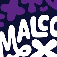
Yes, I am one of those moms. Our kids’ public elementary school in Berkeley ran a design contest for their annual t-shirt fundraiser and I just had to enter! I was actually quite nervous about whether or not my design would be picked based on the wide variety of styles that had one in the past.…
Papyrus Graduation
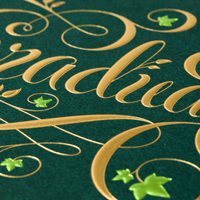
Papyrus has been a wonderful client to work with and they always go over the top with the production of their cards. For this graduation card, there’s 2-color foil printing plus an emboss to make the card feel really special.
Great Stuff Cheap
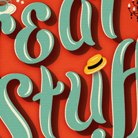
Magazine cover about bargain finds in Denver. The text looks a little overprinty to reference limited color screen printing—a cheap way to achieve great printing results. The barcode went on the white tag in the bottom left corner.
LDS Living Magazine

Full page illustration and spot illustrations for an article about how Christmas is celebrated in different cultures.
Nickelodeon Magazine
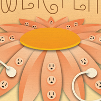
Editorial illustration of seed packets for fictitious plants that can help kids save the environment.
Special K
Honey lettering for a Special K ad which was later made to look like three-dimensional honey. The “final” shown at the top is my own faked version and does not reflect the 3-dimensional post production work that followed.
The Art of Plants
This was used as a logomark for an event put on by Ball Horticulture Company. It could be quite illustrative since the main purpose was for signage.
Say it with Flowers
Originally created for the show “Go Font Yourself” in Australia, this phrase was something I wanted to illustrate for some time. I love collecting random phrases that are a part of pop culture (this one on the wrapping paper of all florists) to future illustrate.
Build Conference
Build is a small, yet perfectly formed, boutique design conference where interesting, talented web practitioners from all over the world come to share ideas, techniques and inspiration. Some are on stage; some are in the audience.
Long Island Pulse
I was honored to work with veteran magazine art director Rip George on this cover for Long Island Pulse. We wanted to create lettering that would wrap around the dancer’s body and compliment her movements, so a script was the natural solution. The lettering was ultimately printed in a shiny…
Oddfellows
Oddfellows is an excellent design and animation studio based in SF and Portland. Collaborating on this logotype project was insanely fun—their work is heavily illustrative, modern, and inventive and they wanted a logotype that matched the vibe of both the work and the people behind the work.
Clog
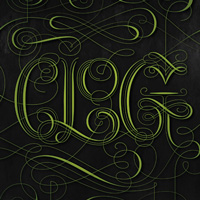
Lettering for an HP Printer ad. GS&P worked with a variety of artists to showcase the beauty of the printed pieces their product can produce (alliteration FTW!) while speaking about the annoying things you definitely won’t experience with their printers.
Dove Chocolate
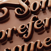
This was a really fun assignment! BBDO contacted me to be a part of their new campaign for Dove Chocolate—I would create lettering, which would then be laser cut into 3d art and then coated in chocolate. The resulting images are really cool, and I particularly like how it looks in the commercial!
Chopard Women’s Day
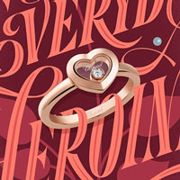
After a successful Valentine’s Day partnership, Chopard approached me again to create new artwork for an International Women’s Day campaign. Sadly, these pieces never saw the light of day—the project was killed before the advertisements were put into production. I still really love the work!
Heart of Darkness
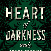
A cover created for Barnes & Noble's leather-bound series, which utilizes two foil colors on leatherette. Each book in this now large series uses similar design and production constraints (two-color foil, similarly detailed borders, and a consistent typeface for the author) so that they look…
Creative Mornings
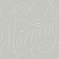
The lovely Tina (aka Swiss Miss) asked me to create a piece for a kickstarter campaign to help fund Creative Mornings and I happily obliged. Nothing makes me feel more creative in the morning than an amazing cup of coffee.
PRPL Shirt
The agency PRPL (Purple Rocks Scissors) asked me, John Contino, Clark Orr, Danny Jones, Ross Moody + Mudshock, and their own Frank Rodriguez to make some swag to celebrate their new site launch. I wanted to give myself a challenge so I decided I wanted the lettering to be modern but to use a…
Admire and Aspire
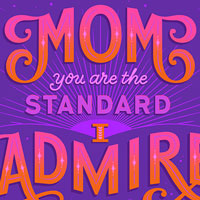
In 2020 Facebook commissioned me to create two Mother’s Day designs for use on the site as static “cards” based on short quotes to help the community celebrate and express gratitude during the holiday. This one uses a dreamy magical sunset palette and was delivered in several format / orientations.
Helpful Things
I’ve compiled this handy dandy page for you full of people, places, and things that I love. I try to update this whenever I find something new and awesome, and only endorse things that I’ve personally used / tried. I’m not getting paid by any of these companies to promote anything, just…
Kellogg’s
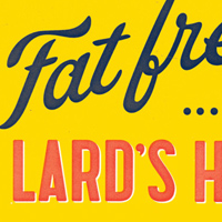
Lettering for a Kellogg’s ad that uses the visual language of some of their earlier ads but with a new twist. Leo Burnett did such an amazing job with this campaign incorporating original imagery from Kellogg’s and new lettering from yours truly.
Muscle & Pluck Forever!
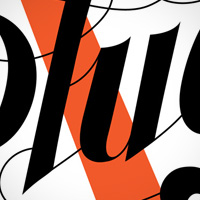
Lettering illustration for a pretty interesting art show called Wearing Whitman’s Words at Lucky Gallery in Brooklyn, in which participants were asked to choose a phrase from Leaves of Grass to illustrate. The designs were then printed on t-shirts.
Aqua Forté
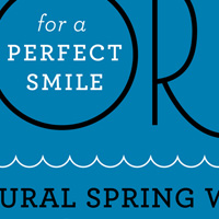
Dr. Paul Tanners wanted to develop the first water that was fluoridated to promote healthy teeth. The label design was printed on clear sticker paper and applied to the water bottles for a very clean and modern look.
40 Eats
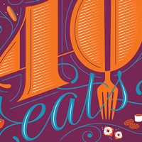
Chris reached out for me to create the cover of the Washington Post’s Weekend section for their annual 40 Eats feature, which highlights 40 culinary things to try in DC. In previous issues, a giant 40 was a prominent feature and, as I love giant letters, I kept that in my design.
Roses
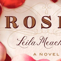
Vintage inspired type for a book cover. The design of the cover is by Anne Twomey and I created the lettering used for the title and author name as well as the ornamentation around the title.
Bing Summer of Doing
Bing put together a really fun campaign this year that I was pumped to be a part of—each day they had a letterer create a search term, something you would do in the summer. For a week, my lettering was posted one day at a time, but it was really fun to see what some of the other letterers did for…
Edgar Allan Poe
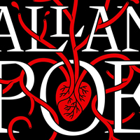
A cover created for Barnes & Noble's leather-bound series, which utilizes two foil colors on leatherette. Each book in this now large series uses similar design and production constraints (two-color foil, similarly detailed borders, and a consistent typeface for the author) so that they look…
Dr. Jekyll & Mr. Hyde
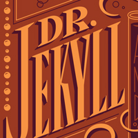
A cover created for Barnes & Noble's leather-bound series, which utilizes two foil colors on leatherette. Each book in this now large series uses similar design and production constraints (two-color foil, similarly detailed borders, and a consistent typeface for the author) so that they look…
Dolly Parton Cover
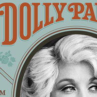
I’m a big Dolly Parton fan (who isn’t??) so when Chronicle contacted me to help out with some lettering for her new book’s cover I was of course in! The design was handled in-house by the creative team at Chronicle and my contribution was Dolly’s name on the cover and spine.
12 Days of Christmas
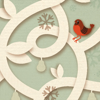
This was a personal project that I sent out as a promo in the winter of 2006. It was a set of twelve postcards, each illustrating one of the twelve days of Christmas. They were all held together with a belly band stating "Happy Holidays" in hand-lettering.
Neiman Marcus Tag
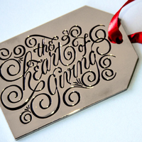
It’s not often that you get to see something you drew etched into silver! These special silver gift tag ornaments were made for Neiman Marcus over the holidays, along side a calligraphic butterfly clip on ornament.
Famous Cats
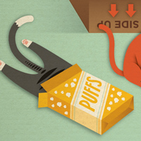
This was basically a dream job: illustrate internet cat memes. I love the internet. I love cats. Win-win. See if you can spot some of your favorites from all of the youtube videos you’ve been secretly watching at work!
New York Magazine Weddings
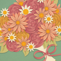
Illustrations for New York Magazine’s Wedding Issue, each dealing with a different section of the directory.
Pet Blue
Illustration for an article about a pet-only airline. The second illustration was for a follow up opinion piece.
Astral Digital
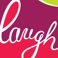
Juniper Park commissioned me to create a number of lettering only advertisements for Astral Digital using both English and French words — the result is a colorful and very lively campaign.
Karma
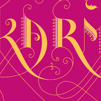
Lettering for a book cover. The final printed book design evolved quite a bit after I handed over final artwork.
Bordo Bello
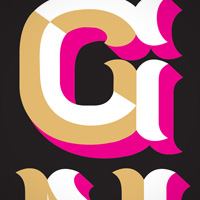
Bordo Bello is a really fun event set up by an AIGA branch in Denver Colorado where designers are sent a blank skateboard deck and told they can do whatever they want with it. The decks were then auctioned off to support the club. This was my design, which I painted onto the deck. The tan areas…
Beyond Tellerrand
Where does the name beyond tellerrand come from? It expresses the aim of everybody involved to look a bit further, look beyond the edge. It also reflects the global perspective of our event. The expression is a mix of the English word “beyond” and the German phrase “Über den Tellerrand…
Levi’s Fashion Your Fit
Levi’s put together an amazing panel of women for their event Fashion Your Fit, held at the San Francisco flagship Levi’s Store. Moderated by Alexis Jones, it was an incredible night, with great conversation and everyone got to walk away with a free pair of jeans.
Snowflake Font
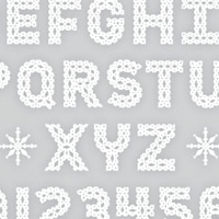
Available through my store, through myfonts and veer. Snowflake is a charming typeface based on cut paper snowflakes. Along with a full alphabet, numbers, accent characters, and punctuation, it also includes snowflake ornaments for borders or patterns! It's similar to crochet work and papel picado,…
The Makeover Issue

A cover for the Boston Globe’s glossy magazine for “The Makeover Issue”, which contained articles on how to makeover your life by improving your fashion, finances, etc.
Quin B Studio
Logo for Bailey Quin, an interior designer specializing in whimsical spaces with a southern twist.
The Odyssey
A cover created for Barnes & Noble's leather-bound series, which utilizes two foil colors on leatherette. Each book in this now large series uses similar design and production constraints (two-color foil, similarly detailed borders, and a consistent typeface for the author) so that they look…
Mighty Logo
Logo for Jason Santa Maria’s new design effort. He and I worked collaboratively on the logo and The Heads of State were also involved in the brainstorming process.
Tattly Designs
Tattly is an amazingly fun shop started by Tina Roth Eisenberg (aka Swiss Miss) selling designy temporary tattoos. Here are a few I’ve designed, and I hope there will be a whole lot more of my designs for sale in the near future!
Tim & Gwenny
When my friend Elliott contacted me to help he and a few pals create a gift for our mutual friend Tim’s wedding, I of course said yes! I made a one-off letterpress print for the occasion and printed it myself at The Arm in Williamsburg, Brooklyn.
Emma Magazine
Cover for Emma Magazine (Emma Willard School). The issue is devoted to how some people are caring for girls — saving girls from slavery around the world, mentoring girls who are without a mother, etc.
The Survival Guide
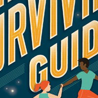
Cover for a student handbook given out at the beginning of the year. Each year they hire a different illustrator to do the cover and lend a hand with some interior decoration, this year's theme was centered around a vintagey space adventure.
Aura
Logo and children’s menu for a Boston-based restaurant. The stylistic reference was a clean woodcut illustration.
Dansko Anniversary
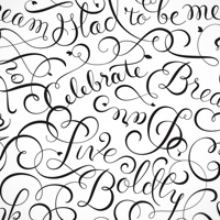
Dansko commissioned me to make a typographic repeat pattern to be used on their special 20th anniversary edition clogs. This was a really fun assignment, and also very challenging, as complex repeat patterns are never a walk in the park. I was really happy with how the pattern turned out and my mom…
Smashing Conference
With our upcoming SmashingConf New York 2014, we'll explore real-life projects, workflows and hands-on insights that we all can learn from and use right away. Same game, same rules: 1 track, 2 conference days, 7 workshops, 18 excellent speakers and just 350 available seats.
Semi-Permanent Wellington
Semi-Permanent brings together internationally renowned designers, artists and creative icons for live events, presentations, workshops and parties. Be inspired.
EatingWell
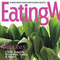
James, the creative director at EatingWell, had done a great job pushing the magazine’s design to have a more contemporary feel. When looking at the masthead, he knew he could only push it so far by himself, so he brought in an expert (me!) to take it to the next level.
American Rose
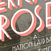
Cover for the new book by the writer of Sin in the Second City chronicling the life and times of Gypsy Rose Lee.
An Event Apart: San Diego
An Event Apart is an intensely educational two-day conference for passionate practitioners of standards-based web design. If you care about code as well as content, usability as well as design, An Event Apart is the conference you’ve been waiting for.
Brioche Font
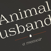
Brioche is a fun revival typeface ready for all of your fancy needs. The roman is modeled after a few 19th century samples with the exception of some special swashy characters (of course I had to add them!). The italic is a new design.
Hoppergrass
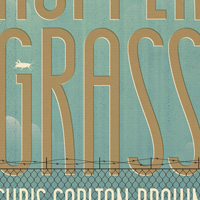
Final and two exploratory sketches for a book cover. The lead character lives in an institution for delinquent teenage boys. “Filled with language that combines the gritty and the truly graceful, Chris Carlton Brown’s debut novel is heartbreaking and unforgettable.”
Thoughts
Rather than keep up a traditional blog, this page serves as a home for writing and as a repository for answers to frequently asked questions about me and my work. For news updates, please follow me on twitter or subscribe for email updates. Please feel free to email comments or corrections.
Helpful Projects
I’ve compiled this handy dandy page for you full of people, places, and things that I love. I try to update this whenever I find something new and awesome, and only endorse things that I’ve personally used / tried. I’m not getting paid by any of these companies to promote anything, just…
Side Projects
Aside from client work, I’ve created and continue to run a few fun side projects. Daily Drop Cap, the first, was pure eye candy and helped jump start my lettering career. Since then I’ve used side projects to exercise parts of my brain that go unused during client time, and have had a blast…
Thousands Under 90
Are you a creative person that constantly submits to competitions but never gets in? Are you over 30 and bummed that you missed your chance to be a 20 under 30? or a 30 under 40? or some other random number under some other random number? Well here’s an award for you. If you think you deserve an…
Greatest Rock Albums
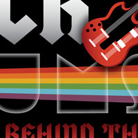
Cover type for a special issue about the Five Greatest Rock Albums and the Stories Behind Them. The main art direction was to give visual cues to each of the five bands, see if you can name them!
The Manual
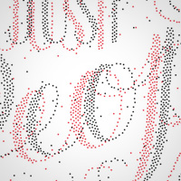
This is a full-spread illustration for the amazing publication, The Manual, put together by Andy McMillan, who is also the founder of the excellent web conference Build in Belfast, Ireland.
Present Company
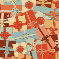
A full page illustration for the cover of the holiday edition of the Style section. This was the start of my career as a ribbon typographer.
I Ain’t Got Time to Bleed
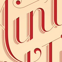
A for-fun lettering project that Russ Maschmeyer and I started and unfortunately didn’t keep up with. The goal was to illustrate phrases from action movies and sort of compete against each other to see who could come up with the best solution.
Designer Vaca
From their site: “We are gathering together female graphic and web designers from all over the country to dream, relax, collaborate, share experiences, and learn from each other. This intimate environment has a relaxed anti-conference feel creating space for amazing connections and beautiful…
Yellow Conference
The Yellow Conference is a gathering for creative, entrepreneurial women who desire to ignite passion and bring goodness to the world through everyday living.
Convene Magazine
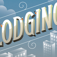
Editorial illustrations for Convene Magazine. The art director loved the way type was treated on another piece that I created, so I adapted it for the new content.
The Art of Saying No
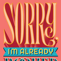
Real Simple ran an issue about saying no to things and commissioned me to make the cover lettering as well as three interior full page pieces of art. The cover lettering I created was then embroidered onto a pillow and shot for the cover of the magazine.
Mother Fucker
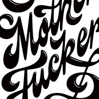
Cards Against Humanity and Chicago Design Museum partnered up to create an expansion pack centered around George Carlin’s Seven Dirty Words. My word was “Mother Fucker”, and I had a lot of fun illustrating it. All sales benefit the museum!
Splenda
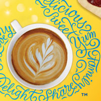
I worked with Johnson & Johnson on a Splenda refresh recently, creating a large S out of words they felt represented the Splenda brand. It was really fun trying to figure out ways to fit everything in and keep things legible and after we settled on a style I created a Spanish and French version…
Victoria’s Secret Pink
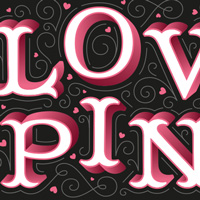
Victoria’s Secret Pink contacted me and a few other artists to create a new VS Pink gift card. People voted for their favorite and the winner was produced.
Lead by Example
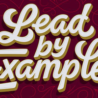
Texas A&M was adopting a new tagline “Lead by Example” to their brand and wanted to create a fold-over card for staff to use. We explored a few styles for the lettering but landed on this bold brush script paired with delicate swashes and details and utilized the college’s brand colors as…
How do you pronounce your last name?
If I were a real German I would pronounce it “Hish-ah” (first syllable emphasized), but since I’m American and we have our own way of pronouncing foreign words it’s pronounced “Hish” (just like “fish” but with an H). Most importantly, there is no “r” in Hische.
FAQ
Rather than keep up a traditional blog, this page serves as a home for writing and as a repository for answers to frequently asked questions about me and my work. For news updates, please follow me on twitter or subscribe for email updates. Please feel free to email comments or corrections.
Pay to Play
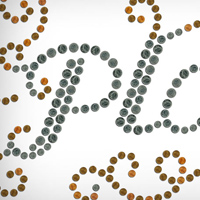
Lettering for William Safire’s On Language section inspired by Rod Blagojevich’s dirty money dealings.
Summer Movie Preview
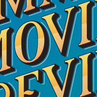
Title type for the Summer Movie Preview Issue. Inspired by vintage fruit crate type but with a much brighter color palette.
The White Rabbit
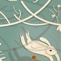
Each year Frank Sturges Reps collaborates on a calendar with a design studio and a printer. This particular year's theme was color, each artist was given a color to illustrate. I chose the color white and illustrated "Follow the White Rabbit".
Way Out West Talks
Way Out West Talks is an initiative taken by Yay Festival and Luger and is a series of talks by inspiring people on Sweden’s most credible music festival Way Out West. This is the first year but the lineup is filled with great names!
KCAI + AIGA
I’ll be giving two talks in Kansas City this spring—the first to KCAI as a part of their “Current Perspectives” lecture series and the second to the KC AIGA branch.
The Write Way
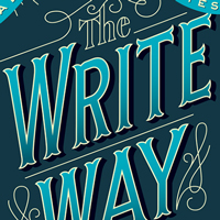
This was a really fun editorial project for an article featuring fiction writing of Northwestern Alums.
Sleepy Hollow
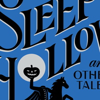
A cover created for Barnes & Noble's leather-bound series, which utilizes two foil colors on leatherette. Each book in this now large series uses similar design and production constraints (two-color foil, similarly detailed borders, and a consistent typeface for the author) so that they look…
Happy Mother’s Day
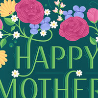
In 2020 Facebook commissioned me to create two Mother’s Day designs for use on the site as static “cards” based on short quotes to help the community celebrate and express gratitude during the holiday. This one pairs a clean typographic style with fun illustrated flowers which surround the…
Papyrus NOEL
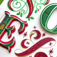
Papyrus really does go all out with the production of their cards sometimes! For this holiday card, they added all sorts of special effects to make it incredibly dimensional, sparkly, and special.
Dorm Room Enlightenment

An illustration for an article about a boy that gets a concussion which leads to a sort of enlightenment about himself and his place in his family.
You Only Live Once
Editorial lettering for Women’s Day Magazine. This ran as a full page illustration.
Avis Ads
Typographic ads for Avis. These ran as full page ads in the Wall Street Journal as well as in In-Flight magazines and as POP displays at in American Airlines Admirals Clubs
AAFUtah
Join AAFUtah as I walk through my process, share stories from projects like my work on Wes Anderson's Moonrise Kingdom, and give plenty of helpful tips on how to better your analog and vector skills. This talk takes place at 11:30am at Publik House, 975 S West Temple, Salt Lake City, UT. Tickets on…
Airbnb Design Talks
Airbnb hosts design talks in their beautiful space. Check in will start at 6pm and promptly end at 6:50pm in order to start the program. Please note an RSVP/per person is required to attend. They will not be able to accommodate any walk-ins. Title links to RSVP.
Collision
Collision is an enormous conference with over 100 speakers including CEOs from top companies, captains of industry in tech, and influencery artist folks like yours truly. I mean...Al Gore is also speaking.
LetterWest
LetterWest is an incredibly intimate event spearheaded by Becca Classon in which forty attendees and the speakers share time in a collective space in Utah—the speakers giving talks or workshops.
Target Tag Lines
Target contacted both myself and Erik Marinovich to letter tag lines that would be used in an internal presentation to some important Target partners. We had a lot of fun “collaborating” (we split up the phrases between the two of us and had to go back and forth to make sure we weren’t being…
Smart Mama
Book cover design for a book about how to be a budget savvy mom without making too many sacrifices along the way.
Target Gift Cards
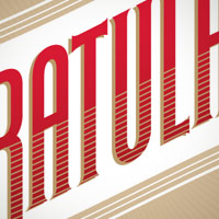
Various Gift Cards for Target, completed with Target and Little & Co. Many are still available in stores across the country, though I’ve discovered that there’s a five dollar minimum when you try to buy yourself one.
AIGA Houston
I presented to AIGA Houston, it was a packed house and the venue was amazing! And Ed, the manager of the space, kept the scotch flowing freely which made for an interesting night.
Twilight!
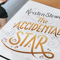
Lettering for People Magazine’s special Twilight issue to celebrate the release of the last movie of the Twilight series. OMG TWILIGHT!
New York Lottery
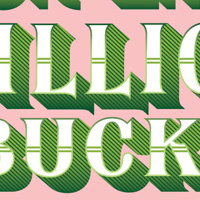
Advertisements used for a Mother’s Day ad campaign for the New York Lottery. These were all over New York and super fun to see in person!
Old Navy Card
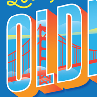
For this gift card, I was asked to create a design that looks like a vintage tourism postcard. We used a bright color palette to keep the art fresh and modern and the design was created in English, Spanish, and French.
Mother Nature's Daddy
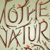
Full page type illustration for an article about Joel Babbit, founder of the Mother Nature Network
The Arm Letterpress
Lettering for a t-shirt and other potential applications for this awesome Brooklyn-based letterpress shop.
Dress Code
Fellow ADC Young Guns and general awesome designer dudes Dan Covert and Andre Adreev commissioned me to do a bit of lettering for their site and general studio branding. It was a total pleasure working them, here's the lettering in and out of context.
Ribbon Type Patterns
Typographic patterns to be used for wrapping paper, cards, wallpaper, anything really. I'm working on several other holidays currently.
Austin Initiative for Graphic Awesomeness
A new, independent speaker series in Austin, TX, organized by UnderConsideration, featuring some of the graphic design industry’s most awesome people.
Fast, Fresh, and Green
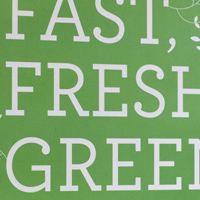
Book cover and interior design for a veggie (but not entirely vegetarian) cookbook
Washington University
Lecture and round-table discussion with Washington University students within the illustration and design departments.
New Adventures
Single-track conference with eight talks, carefully curated to excite, enthuse, and seek outcomes, affordable half-day workshops covering web typography, responsive design, prototyping and much more, and two floors of epic after–party action.
HOW Conference
The HOW Conference is a massive annual conference that shifts location each year. I participated in the 2011 conference in Chicago.
Trashionistas
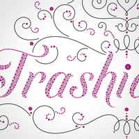
Title type and headline type for an article about The Real Housewives of Atlanta. The title type is made up of illustrated rhinestones. This project was SO fun!
Make-a-Wish
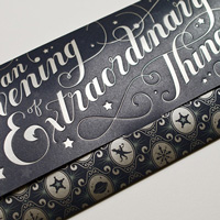
Pro-Bono lettering and illustrative patterns for a gala announcement to help raise money for the Make-A-Wish Foundation.
Bath and Body Works
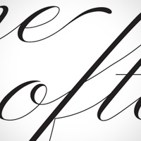
A refined script based on Bickham Script used in an advertising campaign for Bath and Body Works
Anneli Hendrix
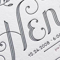
A hand-lettered and letterpressed baby announcement for my friend John Hendrix and his wife Andrea. Tiny type is set in the typeface Coquette by Mark Simonson
Sarah’s Pattern
Sarah Parmenter is one of my favorite ladies. When she asked me if I could help create a pattern to use on her iOS workshop site, I jumped at the chance. She owes me fancy drinks for life. But not really. Love you, Sarah!
Hamilton Woodtype Wayzgoose
Hear that honking sound? That's a flock of your letterpress printing, type geeking, designerly friends getting ready to migrate to Hamilton Wood Type & Printing Museum's Wayzgoose 2016. Mark your calendar for November 4, 5 and 6 and plan to join us in Two Rivers for our annual type conference.
ADC Paper Expo
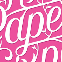
A lovely two color poster the Art Directors Club’s Spring Paper Expo. The poster used the club’s signature hot pink as well as black for the shading. The artwork is meant to look like cut paper but is actually vector illustration.
Logo Refreshes
I specialize in redrafting, reinvigorating, and restoring logos for established brands—enhancing their beauty and legibility through sensitive and subtle updates.
The Archive
Here are projects that have been archived for one reason or another. To see recent and unarchived work, visit the portfolio link below. To inquire about a new project or to license existing artwork, contact Frank Sturges Reps.
How do you come up with font names?
You kind of can’t go wrong if you name typefaces after wine, women, or food. I tend to name my typefaces after things that they remind me of. Ultimately though, you want to give it a name that showcases some of your favorite characters. Buttermilk got it’s name because it felt like a creamy…
Believe It or Not
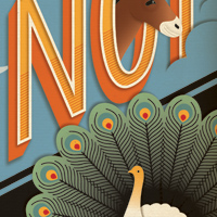
Opening illustration and quarter page illustrations for an article about Penn State’s urban legends.
Bourboncide
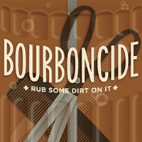
An illustration for an article about a men’s grooming salon. I kind of wish Bourboncide existed...
Men We Love
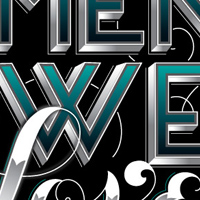
Editorial type for an article about men Bust Magazine adores. Was set opposite a photo of Will Arnett, whom I personally think is awesome.
Welcome the New Year
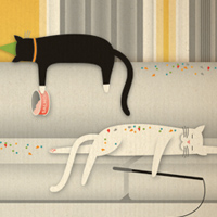
For a financial magazine article about getting back to work after the New Year celebrations are over.
AIGA New to You
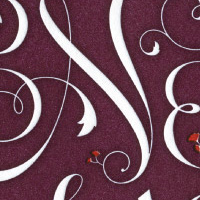
Branding for the 2009 New to You lecture series. The type design was used on promotional materials and I letter-pressed these postcards to hand out at my lecture.
UX Week 2015
Design professionals from all over the world gather for four days of community, inspiration and skills building. Now in its 13th year, UX Week delivers new tools you can put to use immediately.
Portland Design Week 2018
This year I’ll be heading up to Portland to participate in their amazing design week! I’m hosting a sold out lettering workshop and am taking part in a group lettering art show.
Fiction
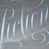
As a part of Collins’ 55 Theses project, I was asked to illustrate the word “fiction” in whatever means I wanted.
The Art of Faking It
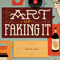
Book Jacket design for a book about appearing knowledgeable about things you really only have limited knowledge of.
Washington State Lottery
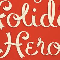
Ads for the Washington State Lottery “You Deserve a Holiday Bonus” campaign.
Buzzwords of 2008
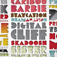
The Buzzwords of 2008 for the New York Times Week in Review. I decided to create an alphabet to spell out all of the words and let interior textures and patterns conceptually show what the words meant.
State of the Union
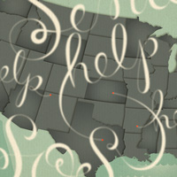
Full spread illustration for an article entitled “The State of the Union” about the current economic climate.
Papyrus Goodbye
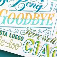
I’ve been having a lot of fun working with Papyrus this year on greeting cards. Here’s one to bid au revoir to a special someone.
Brooklyn for Barack
I had the pleasure of donating a poster for a fund-raising event at the McCarren Park Pool venue in the summer of 2008 in support of the Obama presidential campaign.
AIGA Nebraska
I’ll be speaking in Omaha in February, my last traveling speaking gig for much of 2015 (no traveling from March 1st to early Fall 2015). I’ll be incredibly pregnant, so it should be a really fun talk!
AIGA Honolulu
Designer Dialogue with Jessica Hische at the University of Hawaii at Manoa Art Auditorium.
Orchard Park
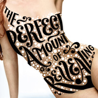
Ads for Orchard Park Mall. I had a ton of fun working on these advertisements, and this is a selection of all of the ads produced. Who wouldn’t love to letter on top of a hot lady body?
Contact Me
Thanks for thinking about me for your project, partnership, conference, etc! I've put together this slightly excessive contact page to make sure your inquery goes to the right place and doesn't get accidentally buried in my very messy inbox.
NYT Op-Chart
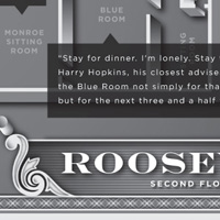
An Op-Chart for The New York Times showing White House floor plans of various presidents.
Bartholomew Fortuno
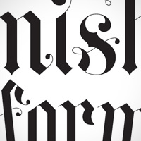
Lettering for a book cover. Unfortunately this version of the cover did not end up being printed, but the art director was quite happy to let me show it to you here.
Ruhland & Ruhland
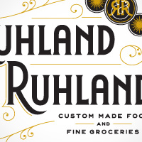
An identity for a fancy deli in Germany. The owner wanted the store to have a vintage feel and wanted a logo that would have the quality of an early 20th century mark but still feel at home in the 21st century.
Hallmark Creative Leadership Symposium
The symposium is a once a year, one-day event where all of Hallmark’s creative organization and some of their key business partners all come together to pause and be inspired by though-leaders, style influencers and creatives from around the globe.
Adobe Max 2018
Adobe Max is an enormous cross disciplinary conference put on every year featuring leaders from all creative fields plus a few star celebrity keynotes. For the 2018 conference, I spoke on the publication date of my kids book!
Work
I strive to create beautiful and legible work with just enough personality and a high level of technical precision.
San Diego Reader
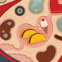
Cover Illustration for an article about a guy that gets a lot of surgery in Tijuana.
Logos
In addition to updating existing brands, I love collaborating with designers, agencies, and in-house teams to create new logos or consult on logo development.
American Greetings “Infusion”
I had the pleasure of speaking at American Greetings alongside many other notable speakers at their in-house conference, “Infusion”.
Tyler Open Houses
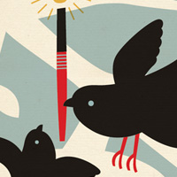
Tyler School of Art, my alma mater, commissioned me to create these two posters to advertise their Fall and Spring open houses.
Dale and Thomas Lemonade
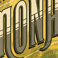
These lemonade labels were unfortunately never produced despite how much Markham and I (and everyone else that laid eyes on them) loved them.
AIGA Cal Poly
I’ll be speaking at Cal Poly in San Luis Obispo in partnership with AIGA.
Quotes & Accents
Quotation marks, accented characters, and dashes—we all need to use them but hardly any of us know how to type them. Here is a brief guide of how to quickly type smart quotes and accented characters (and dashes) on a Mac complete with occasionally humorous examples.
Summer Book Preview
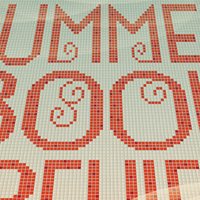
Illustrations for the Wall St. Journal’s Summer Book Preview. I now very much appreciate “pixel art”.
Facebook
As a part of Facebook’s artist lecture series, I talked bout my work and in particular struggling to stay small in a region obsessed with scale.
Kate Murphy
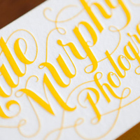
Logo for Kate Murphy Photography. Kate was an awesome client, everyone hire her to take your photos!
A2A Lecture
Lecture sponsored by the Type Directors Club at A2A Graphics in Connecticut. The lecture was also live-streamed to TDC members that signed up.
Target: Spark
Spark is a lecture series put on by Target for their marketing team.
AIGA Colorado
A Lecture for AIGA Colorado in Denver hosted at the beautiful Denver Art Museum.
Apple Store SF
As a part of the ADC Young Guns partnership with the Apple Store, I lectured at the San Francisco downtown location.
Layers
Layers is an inspirational conference that runs alongside Apple’s WWDC.
UVU Lecture
A lecture for students at UVU in Utah.
Awesome
Hello!
Awesome
Hello!


